The Gentle Language of Wildflower Paintings
Wildflower paintings can look spontaneous at first: a field of stems, a few pale blooms, perhaps a horizon dissolving into weather. Spend another minute with one, however, and the apparent looseness starts to reveal decisions. Some flowers lean toward the light. Others form a dense band across the foreground. Open ground may be just as important as the blossoms themselves.
That is what separates a memorable meadow scene from generic floral decoration. A garden bouquet is arranged around a center; a wildflower field is read across space. The painter has to suggest chance while controlling color, direction, and distance. The result can feel natural, but it is rarely accidental.
This guide offers a practical way to read wildflower paintings through composition, density, season, movement, background, and scale. You do not need an art-history vocabulary. You only need to notice what your eye follows first—and what keeps drawing it back.

In This Article
How the Flowers Are Arranged
Begin with the largest shapes rather than individual petals. Is the floral activity spread from edge to edge, gathered in one corner, or held in a band near the bottom of the canvas? This first reading tells you whether the painting is expansive, intimate, or deliberately cropped.
A field that fills the entire foreground often creates abundance. A smaller cluster surrounded by sky or bare ground gives each stem more importance. When blooms enter from one side and lead toward the center, the composition can feel as though the viewer has just stepped into the scene rather than being shown a formal view.
Look for one visual anchor: a darker seed head, a pale flower, a bend in the path, or a break in the distant trees. Strong wildflower paintings usually give the eye a place to begin, even when the rest of the image appears informal.
Density Changes the Painting’s Mood
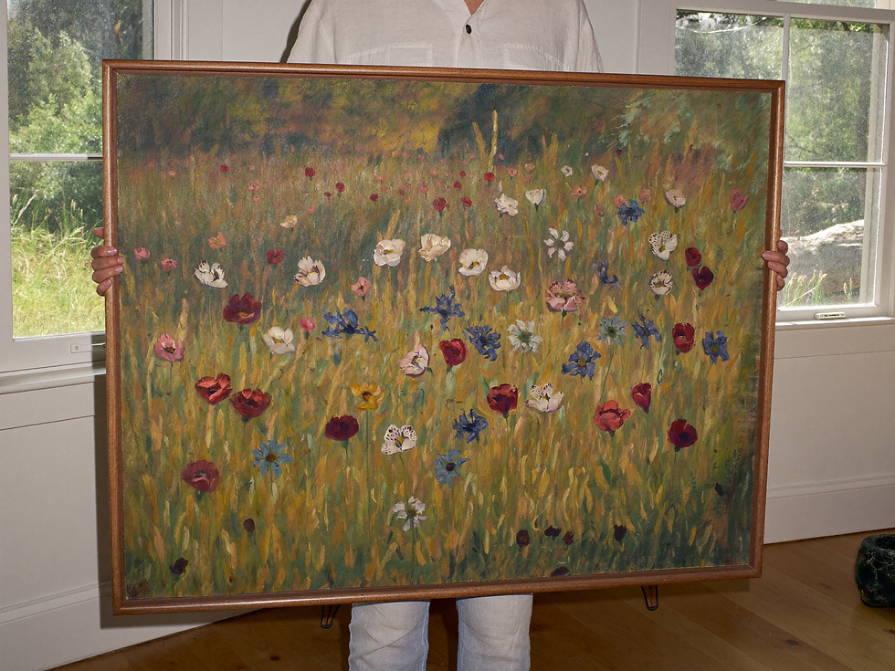
Density is one of the quickest ways to distinguish two meadow paintings with similar colors. Tightly packed flowers produce energy and surface pattern. Widely spaced stems expose more field, soil, and air, making the landscape feel broader and more observational.
Neither approach is automatically better. A dense foreground can suit a small work viewed at close range because the details reward inspection. A more open composition often performs better at a larger scale, where the gaps between flowers become part of the architecture of the image.
Try looking at the painting as a thumbnail, then again at full size. If it only works close up, the detail may be carrying the composition. If it remains legible from a distance, the painter has probably balanced the floral marks with strong larger shapes.
Color Can Suggest a Season
Wildflower paintings often imply a season through color before they describe it through species. Fresh yellow-green, clear blue, and small white notes can suggest early summer. Ochre grasses, mauve flowers, and softened greens tend to read as late summer or the first weeks of autumn.
Notice where the strongest color sits. A small red or blue accent near the center can organize an otherwise neutral field. Repeating that color too evenly across the canvas changes it from an accent into a pattern. Painters use this distribution to control how quickly your eye crosses the scene.
The most convincing palettes include colors that are not immediately floral: greyed soil, violet shadow, chalky sky, faded straw, and deep green-brown. These less glamorous notes prevent the flowers from floating on the surface and help the landscape feel inhabited by weather.

Stems and Grasses Carry the Movement
Flowers may attract attention, but stems and grasses usually carry the movement. Upright lines make the field feel still and structured. Repeated diagonals suggest wind. Curved stems can lead the eye from foreground detail toward the softer distance.
Brush direction matters here. Long, confident marks give grass a different physical presence from short dabs of color. When every stem is described with equal precision, the scene can become diagrammatic. Selective detail feels more believable because real vision also sharpens in some places and relaxes in others.
Follow three or four stems from bottom to top. Do they converge, cross, or break apart? That small exercise often reveals the compositional rhythm more clearly than naming the flowers. It also explains why two paintings of the same subject can have completely different energy.
The Background Is Doing More Than It Seems
A meadow needs somewhere to continue. The background may be a distant hedge, a low hill, a strip of water, or simply a pale field moving toward the horizon. Its job is not to compete with the flowers; it establishes depth and gives the foreground a believable location.
Soft distance can also sharpen the character of the nearer plants. A crisp seed head against a blurred field reads more clearly than the same shape against a busy hedge. This is why cropping a meadow painting too tightly can weaken it: remove the background and you may remove the space that makes the flowers matter.
The role of light becomes especially clear in pastoral painting. In The Poetry of Soft Light in Pastoral Art we look at how cloud cover, haze, and angled sunlight build depth without relying on dramatic contrast.

Choosing the Right Scale
Scale changes what a wildflower painting becomes. A small botanical study asks you to come closer and inspect individual marks. A wide meadow landscape is read more physically: the horizon stretches, the field opens, and the body registers distance before the mind studies detail.
Before choosing a size, identify the part of the image you value most. If it is the texture of petals and stems, a medium print with a generous mat may be enough. If it is the sense of entering a field, a larger horizontal format will preserve the breadth of the composition.
Also check the crop at the final ratio. A landscape that works in 3:2 can lose important side movement when forced into a square frame. Printable art offers useful flexibility, but the chosen crop should protect the painter’s anchor, horizon, and directional lines.

Why Wildflower Paintings Hold Up Over Time
A good wildflower painting does not exhaust itself in one glance. The main image is readable immediately, but smaller relationships emerge later: one pale bloom against a dark stem, a weather change on the horizon, or a patch of raw canvas that begins to resemble sunlight.
That layered reading is why meadow scenes can feel personal without illustrating a specific story. One viewer notices abundance; another notices exposure, distance, or the end of a season. The painting provides structure, then leaves enough room for memory to enter.
If narrative is what attracts you to art, Romanticism Vintage Art: When a Painting Reads You explores the same exchange from a more dramatic angle. Wildflower works often make that exchange through ordinary details rather than grand events.
The useful question is not whether a meadow painting matches the room. Ask whether its arrangement, color, and movement continue to give you something to notice. If the answer stays yes after several viewings, the work is doing more than decorating a wall.
Wildflower paintings reward ordinary attention. Read the large shapes first, then the stems, color shifts, and background intervals. The more precisely you look, the less generic the subject becomes.
Words and visual direction by Havenest.


Comments