Pomegranates Beside the Painted Vase: A Room for Rich Color
A room can welcome a rich color without surrendering to it. A small patch of red in a painting may be enough: something for the eye to find among pale walls, everyday furniture, and the familiar things that have accumulated over time.
In Havenest’s Pomegranates Beside the Painted Vase, that patch is the exposed interior of a fruit. Ruby seeds interrupt the pale rind at the front of the table. Behind it, peaches gather in a shallow bowl, a decorated vase rises on the left, and a patterned cloth extends toward us. The scene offers plenty to see, but it makes no demand that we see everything at once.
The pleasure is in this measured richness. Looking at the painting closely reveals a useful principle for living with color: give a vivid detail somewhere restful to belong.

Pomegranates Beside the Painted Vase. Artwork by Havenest.
In this article
Begin with the opened fruit
Start at the lower right, where the cut pomegranate turns its interior toward the viewer. The rounded rind establishes a simple shape; the seeds break that simplicity into small, irregular clusters. Pale partitions separate the red areas, so the color never becomes a single flat patch. Even within this small object, the eye moves between brightness, shadow, and interruption.
Another pomegranate sits higher, beside the peaches, its opening turned at a different angle. The crown and darker rind give it a distinct outline, while a narrower strip of visible seeds echoes the cut fruit in front. The two views repeat the red at different heights without duplicating the same shape.
It is tempting to give every fruit a symbolic meaning. This painting does not require that approach. We can begin with what is visible: a surface opening, a concealed color becoming available, an ordinary object becoming more complicated under attention. If an association with generosity or abundance follows, it belongs to our reading rather than to a documented story about the artwork. That distinction leaves the scene open enough for a second visit.

Room mockup: the artwork becomes part of a furnished wall.
Follow the balance between height and weight
The vase and fruit occupy the table in different ways. On the left, the tall vessel creates a steady upward movement. Its broad body narrows at the neck, then opens again at the rim. On the right, the low bowl spreads the fruit laterally. The composition needs both gestures: the vase gives it stature, while the clustered round forms keep it connected to the tabletop.
Notice the wall between and around these objects. Its comparatively uncomplicated surface gives the decorated vase room to remain legible. It also prevents the arrangement from becoming a continuous field of fruit, flowers, and folds. Empty space has an active role here; it separates one kind of looking from another.
A useful way to test the balance is to cover either side briefly with your hand. Without the vase, the fruit feels low and self-contained. Without the fruit, the vase becomes a more solitary portrait of an object. Together, they establish a conversation across the table. Our guide to reading a still life through five questions offers other ways to notice these relationships before reaching for an interpretation.
Let the cloth reveal its second pattern
At first, the table covering reads as a pale foundation. Stay with it and its woven-looking floral pattern becomes much more noticeable. Large light motifs unfold across the foreground, with softer lines disappearing into folds. The cloth has its own ornament, but the subdued contrast allows that ornament to arrive after the fruit and vase.
This is an important difference between a composition that is intricate and one that feels crowded. Several patterns can coexist when their visual strength varies. The vase carries colored decoration, the pomegranate carries concentrated red, and the cloth carries a quieter variation of light against light. Each occupies a different level of emphasis.
For a room, the lesson is practical. A painted vase in an artwork can sit happily near a real patterned textile when the surrounding colors have somewhere to settle. You need not repeat every motif. A plain cushion, an unadorned wall, or a clear area on the sideboard can do the work that the background does within the painting. The writing-desk mockup demonstrates this exchange: objects gather nearby, but the frame keeps the pictured arrangement distinct.

Writing-desk mockup: a closer setting for looking at the details.
Build a palette from the least obvious color
The pomegranate seeds are the obvious accent. Yet a room built entirely around that red could miss much of the painting’s character. Look also at the warm cream of the vase, the peach blush, the subdued blue of its decoration, and the gray-brown notes in the cloth. These less insistent colors give the red its context.
Choose one of those supporting tones as the link to your existing room. An oatmeal textile might echo the table covering. A muted blue bowl could answer the decoration on the vase. Warm wooden furniture can sit beside the fruit colors without copying them literally. Once that connection exists, the red can remain largely inside the frame.
Try the work against your wall in daylight and again with the lamps you actually use. The surrounding room changes how readily the darker edges and paler cloth separate. A mockup suggests a possibility; it cannot determine the exact color relationship in your home. Let your own furnishings provide that final test. The aim is a believable conversation between the painting and the room, including the things you already own.
Give a dining corner something to discover
Fruit still life has an immediate visual connection to a place where people eat, but this artwork offers more than a subject match. Its arrangement rewards different distances. Across a room, you can read the tall vase and rounded cluster. From a chair nearby, the opened pomegranate and patterned cloth become available. A dining corner allows both encounters naturally.
Consider the sightline from a seated position before deciding where the frame belongs. You want the smaller details to remain approachable, rather than placing the work so high that only its general colors register. Use a paper rectangle to test the proposed outer frame dimensions on the wall, then sit down where you normally sit. Actual viewing distance is more useful than a decorative rule applied without context.
The bedroom mockup suggests another possibility: food imagery can belong outside a kitchen or dining room when its color and rhythm suit the setting. Here the fruit becomes a warm presence beside fabric and wood. If framing choices are the next decision, our guide to framing printable wall art can help you consider the frame as part of the finished arrangement.

Bedroom mockup: the artwork shown beside furniture and lamplight.
Pair richness with breathing room
When pairing this print with another artwork, resist the urge to find a second image containing all the same objects. Two busy tabletops may compete if both ask for close inspection in exactly the same way. A companion with more open background, a simpler vessel, or a quieter range of colors could create a more generous rhythm.
Look for one shared quality and one meaningful difference. Perhaps both works have a warm ground, but one centers fruit while the other gives more space to a single flower. Perhaps a small blue passage links them, while their dominant shapes differ. The pair then feels connected without appearing to repeat the same sentence.
The library mockup gives a useful impression of how the fruit can hold its place among deeper colors. The pale cloth helps the artwork remain readable even when surrounding furniture and walls are comparatively dark. If you are building a pair, our guide to placing two still lifes on one wall develops this idea through proportion, spacing, and visual balance. Allow the individual paintings enough separation that each can still be encountered on its own.
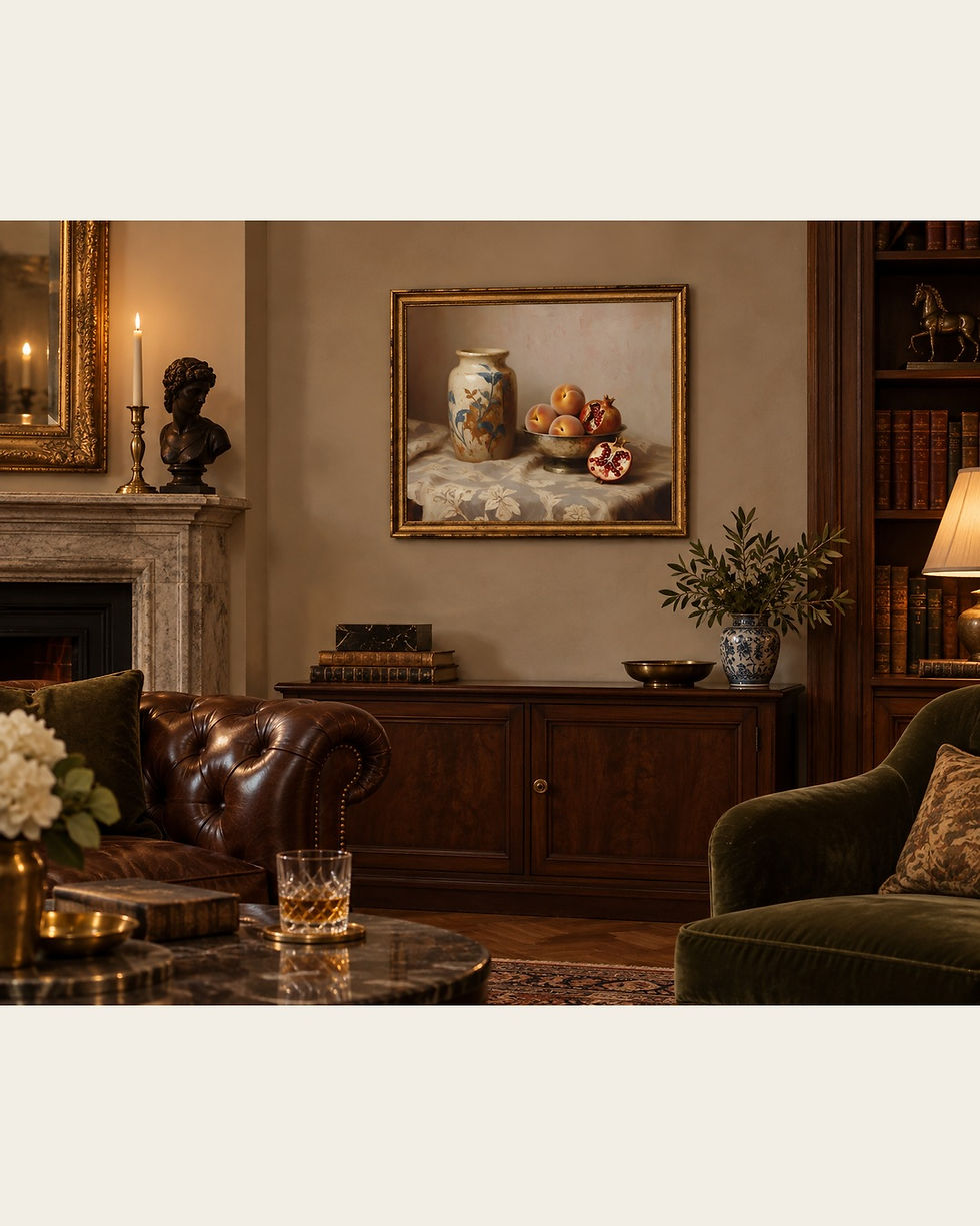
Library mockup: the artwork shown against a deeper interior palette.
Keep one vivid detail for yourself
There is no need to finish looking at this painting in a single sitting. One day the fruit may seem central; another day the curve of the vase or the cloth’s nearly hidden pattern may hold your attention. A familiar artwork can change because your attention changes, even while the arrangement itself remains fixed.
That is part of its usefulness in a lived-in room. The scene offers a small, stable place for the eye to return, yet it includes enough variation to avoid becoming a single decorative gesture. The exposed seeds bring the initial spark. The surrounding neutrals allow that spark to last without taking over the whole wall.
If this balance of color and restraint belongs in the room you are imagining, explore Pomegranates Beside the Painted Vase on Etsy. The listing is the place to review the current download details before choosing a print size and frame. Begin with the actual wall, the furniture beneath it, and the colors you already enjoy. Then let this one vivid detail find its place among them.
Written by Havenest Studio


Comments