How to Frame Printable Wall Art: Mat, Frame, Glass, and Scale
A printable artwork can look complete on screen and still feel undecided once the file becomes paper. The print rests on the table, the wall is waiting, and suddenly the quiet choices around it—mat width, frame finish, glazing, scale—begin to shape how the image will live in the room.
That is the useful truth about framing: the frame is not simply decoration. It is the architecture around the artwork. It controls breathing room, protects the surface, and helps the eye understand whether a piece should feel intimate, formal, airy, or dramatic.
This guide follows naturally from Best Paper for Printable Wall Art. Once you have chosen the paper and made the print, these seven decisions will help you frame printable wall art with confidence—without losing the character that made you choose the artwork in the first place.

In This Article
1. Start With the Final Print Size
Begin with the size of the paper you will actually frame—not only the dimensions of the digital file. A print may be enlarged, reduced, bordered, or cropped slightly during printing, so measure the finished sheet before buying a frame or cutting a mat.
Then work outward. The visible artwork, the mat border, and the frame moulding all add to the final footprint on the wall. A modest print can become a substantial object once it receives a wide mat and a broad frame. That can be an advantage above a console or reading chair, but it needs to be planned rather than discovered after assembly.
Use painter's tape or a paper template to mark the full outside dimensions on the wall. Step back from the doorway, the main seat, and the place where you first enter the room. The outline should feel related to the furniture beneath it, not stranded in the space and not crowded against nearby objects.
If you are still deciding how the downloaded file becomes a physical print, read How Digital Wall Art Works. For a wide placement above furniture, the scale examples in Large Horizontal Wall Art Above a Sofa are a helpful companion.
2. Decide Whether to Use a Mat
A mat creates a pause between image and frame. For a detailed portrait, a literary scene, or a work with a dark edge, that pause can keep the composition from feeling compressed. It can also prevent the printed surface from sitting directly against the glazing when the frame is assembled correctly.
Choose the mat tone beside the actual print and in the room's light. Bright white can make cool paper and crisp black lines feel cleaner. Warm white or soft ivory often sits more gently with aged pigments, parchment tones, antique gold, and the muted greens and reds found in Romanticist artwork.
The width should be generous enough to look intentional. A narrow border on a large piece may appear accidental, while an oversized border can turn a small image into a quiet focal point. Keep the four sides visually balanced; a subtly deeper bottom margin can feel grounded, but the difference should remain restrained.
If you prefer the artwork to meet the frame directly, use spacers or another suitable framing method so the print does not press against the glazing. The aim is not to follow one universal rule. It is to give the image the amount of silence it needs.

3. Match the Frame to the Artwork
Look at the artwork before you look at the room. Find the lines, values, and materials already suggested by the image. Deep walnut can echo warm shadows and old furniture. Black can sharpen a graphic composition. Pale oak can lighten a quiet landscape. A fine gold edge can repeat a small highlight without turning the frame into the main event.
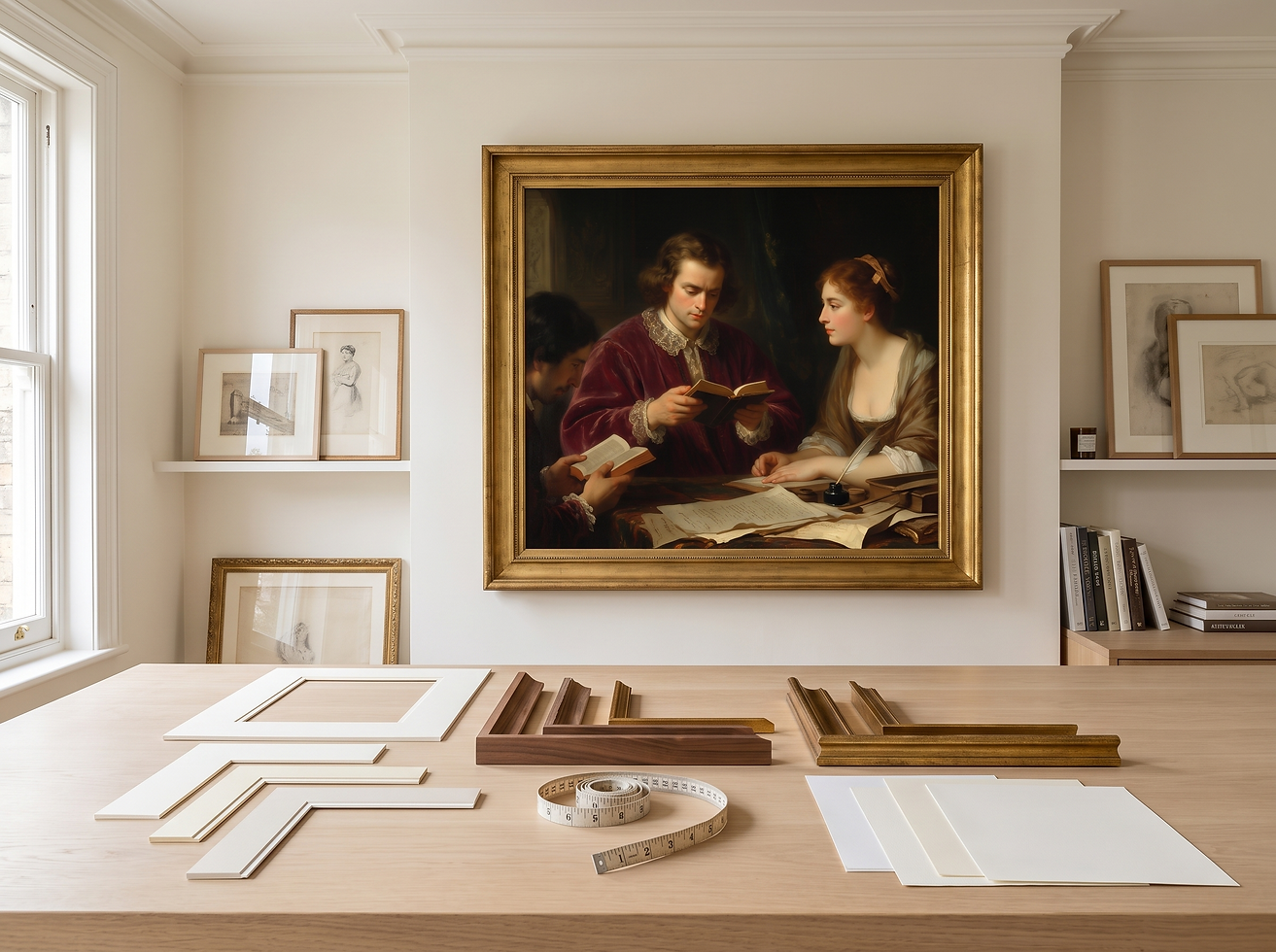
For example, "The Poet's First Verse" carries a scholarly, intimate atmosphere. A walnut frame and an ivory mat support that mood because they repeat the warmth of books, wood, and aged paper rather than competing with the figure.
Frame profile matters as much as color. Delicate moulding suits smaller, quieter prints, while a larger artwork usually needs enough visual weight to hold its place on the wall. Ornate profiles work best when their rhythm answers something in the painting—architectural detail, ceremonial clothing, gilded objects—not merely because the room is traditional.
Before committing, place two or three sample corners against the print and photograph them in daylight. The right frame usually makes the image feel clearer and more settled. If you notice the frame first and the artwork second, simplify.

4. Choose Glass or Acrylic Glazing
Glazing protects the print from dust, handling, and everyday contact. Standard picture-frame glass offers clear viewing and good scratch resistance, but it is heavier and can break. Acrylic is lighter and shatter-resistant, which makes it useful for larger frames, busy family spaces, or walls where weight is a concern.
The room decides whether reflection will be a problem. Face the empty frame toward the window and lamps before installing the artwork. If bright shapes obscure the center of the image, consider reduced-reflection glazing or move the placement slightly. Very matte glazing can soften fine detail, so compare samples with the artwork rather than choosing from a label alone.
UV-filtering options can reduce light exposure, but no glazing makes a print immune to strong sunlight. Avoid a wall that receives hours of direct sun. Stable light and a comfortable indoor environment will do more for the print than a dramatic location beside an unshaded window.
Paper surface and glazing should also be considered together. A textured matte paper behaves differently under glass from a glossy photo paper; the comparisons in Best Paper for Printable Wall Art will help you choose the combination before ordering the final print.

5. Mount the Print Without Damage
A beautiful front deserves a careful back. Let the print dry and relax flat before framing, especially if it has been produced with inkjet printing. Work on a clean surface, wash and dry your hands, and remove dust from the glazing and mat before closing the frame.
Use an acid-free backing board and a mounting method intended for artwork. Archival hinges hold the top edge while allowing the paper to move slightly with changes in humidity. Ordinary household tape, glue sticks, and pressure-sensitive mounting sheets can discolor paper or make future removal difficult.
Do not force a slightly oversized print into the frame. Trim only if the composition and intended ratio allow it, and use a straightedge and a sharp blade on a protected surface. When the border or signature matters, a custom mat opening is often safer than cutting into the image.
Before sealing the back, stand the frame upright and inspect it from several angles. Check for trapped fibers, a crooked horizon, a shifting mat, or a print that touches the glazing. Five quiet minutes at this stage can prevent taking the entire frame apart later.
6. Hang at the Right Height and Scale
Eye level is a starting point, not a fixed law. In a hallway, the viewing height is usually standing. In a reading room or dining area, the artwork is often experienced while seated. Let the normal way people use the room guide the center of the frame.
When a piece hangs above furniture, relate it to that furniture rather than to the ceiling. The gap should feel connected without making the frame look as though it rests on the object below. Use the full outside frame size—not the printed image alone—when judging proportion.
Tape a paper template to the wall and leave it there for a day. Notice it in morning light, at night, and from the adjacent room. For a wide or heavy frame, use suitable hardware and two secure hanging points so the artwork stays level. If you are unsure about the wall material or load, ask a professional installer.
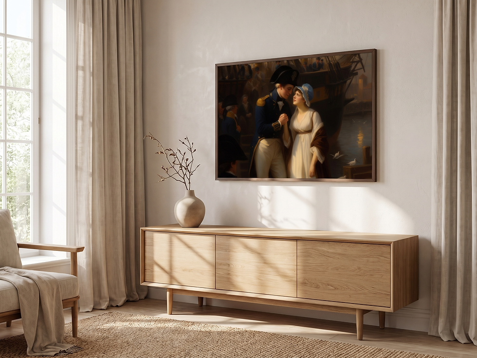
The restrained landscape mood of "Farewell at the Harbor" works well above a low console because the horizontal movement in the scene continues through the furniture line. The frame supports that relationship without demanding a heavily decorated wall.
7. Run a Final Framing Check
Before the frame goes on the wall, look at it as one complete object. Is the print centered? Does the mat tone belong to the paper? Is the frame profile strong enough for the final size? Can you see distracting reflections from the usual viewing position? Is the backing secure and the hanging hardware appropriate for the weight?
Then look for what cannot be measured. The artwork should still feel like itself. The frame may make it calmer, richer, lighter, or more architectural, but it should not rewrite the image. Good framing does not announce every decision; it allows the viewer to arrive at the work without resistance.
If you would like to practice these decisions with art chosen for atmosphere and story, explore Havenest's Romanticism vintage art collection. You can begin with "The Circle of Poets", compare its quiet academic mood with "The Lady of the Golden Chalice", and choose the piece whose story already feels at home in your room.
The file may arrive instantly, but the finished wall is built through slower choices: paper, border, frame, light, and placement. That small ritual is part of the pleasure. It turns a downloaded image into an object with presence—and a blank wall into a place that remembers.
Words and visual direction by Havenest.


Comments