One Wall, Two Still Lifes: A Guide to Pairing Art

A hanging landscape and a leaning botanical print show how related frames can connect different subjects. Havenest editorial visualization. Image source.
Two still lifes can share a wall without becoming a matching set. A bowl of fruit and a single vessel may have very different moods, yet a related shadow, curved form, or frame finish can give them a reason to be together.
The difficulty usually appears after the pictures are chosen. One seems heavier, the gap looks accidental, or the pair feels disconnected from the furniture below. These are arrangement questions, and they can be tested before anything is hung.
Begin with the images, then work outward through frames, spacing, and the room. The measured examples below are hypothetical layouts using outside frame dimensions; they are starting points to adapt to your own wall.
In this article
Find One Shared Feature and One Difference
Set the two images side by side at roughly the same viewing size. Look first at their largest shapes and light-dark patterns. A dark background behind pale fruit may connect to the shadowed side of a vessel even when the dominant colors differ.
Choose one clear relationship: related colors, repeated rounded forms, similar brushwork, or a comparable amount of open background. Then keep a difference that makes looking between them worthwhile. A crowded tabletop can sit beside a more spare composition if the framing and spacing help hold the contrast together.
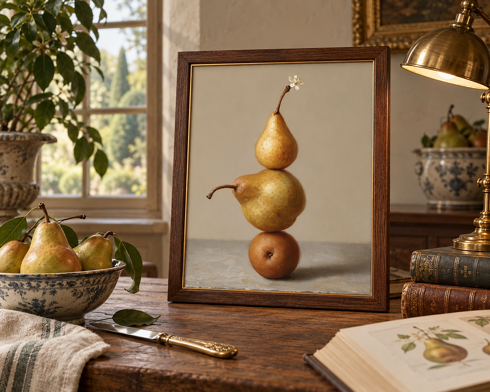
Pears in a Golden Stack offers rounded forms and a warm pale background to compare with a ceramic study. Havenest room visualization.
Subject alone is a weak reason for pairing. Two paintings of pears can still disagree in saturation, scale, and visual density. Conversely, a fruit picture and a ceramic study may feel connected through their curved silhouettes and warm light.
For a useful first test, view small versions against a plain background. If one picture immediately overwhelms the other, try a different partner before changing the room around it. The aim is a relationship that remains visible when decorative distractions are removed.
Give yourself permission to change the pairing after the first test. Sometimes a second image is appealing on its own but asks for a different wall. Try the proposed works at the same time of day and under similar lighting so the comparison reflects the pictures, rather than a bright screen beside a shaded print.
Balance Visual Weight Before Matching Size
Equal outside dimensions do not guarantee equal visual weight. Dense dark areas, strong contrast, and a heavy frame can make one work seem more substantial than a paler image of the same size. Notice the effect rather than trying to correct every difference.
If one work leads, allow the second to support it. A modestly wider mat around the lighter image may give it more presence, provided the treatment suits the work. Alternatively, keep the framing similar and place the heavier picture where it helps balance another strong element in the room.

A still life can carry fruit, flowers, and folds while the actual tabletop remains simple. Havenest editorial visualization. Image source.
Avoid enlarging an image automatically. Enlarging can change which details dominate, and a print must have suitable source dimensions for the intended output. Check the actual file and printing guidance before choosing a larger image size.
Photograph the proposed pair together, then briefly look at the photograph in black and white. This can make differences in light and dark easier to notice. It is an observational aid, not a scoring system: a pair may work precisely because one picture carries more weight.
Use Frames to Support the Relationship
Think of framing as another part of the composition. Matching simple frames can unite two images that differ in subject or palette. Related finishes with different profiles can preserve the sense that the works were chosen individually.
Compare samples beside both images if possible. A warm brown frame that suits an ochre still life may make a cooler white vessel look more yellow by comparison. A mat can introduce a separating interval, but its color also needs to work with both the image and the wall.
Distinguish four measurements: the image itself, the sheet of paper, the mat opening, and the outside of the finished frame. The outside measurement controls wall spacing. A frame sold for a 12-by-16-inch image does not necessarily measure 12 by 16 inches on the wall.
Preserve the artwork's proportions when printing. If the chosen frame has a different ratio, use an appropriate mat or another frame size rather than stretching the image. Our guide to framing printable wall art explains the decisions around mats, frame profiles, and glazing in more detail.
Calculate a Horizontal Pair With Outside Dimensions
Consider a hypothetical 60-inch-wide sideboard against a wall with sufficient clear space. Two finished frames each measure 18 inches wide by 24 inches high on the outside. With a 3-inch gap, the total arrangement is 18 + 3 + 18 = 39 inches wide.
If the pair is centered on the sideboard, it leaves (60 − 39) ÷ 2 = 10.5 inches between each outer frame edge and the corresponding sideboard edge. Those are horizontal offsets in this example, not a universal proportion rule. Check nearby switches, shelving, curtains, and any furniture that changes the usable wall span.

Use outside frame dimensions when planning the arrangement. Havenest editorial visualization; the photograph does not represent the measured example. Image source.
Using the left sideboard edge as a horizontal zero point, the left frame runs from 10.5 to 28.5 inches. The right frame runs from 31.5 to 49.5 inches. The centerlines are therefore 19.5 and 40.5 inches. Marking frame centers first can make the overall arrangement easier to understand.
Now test the height separately. Make two 18-by-24-inch paper templates and move them together while preserving the gap. View them from the doorway and seated nearby. The guide to art height above furniture helps assess that relationship; its general starting points still need adjustment for the actual room.
Give Different Formats a Clear Alignment
A portrait and a landscape can work together without forcing either into the other's proportions. Try aligning their centers first, then compare that with a shared top edge. A center alignment often makes the pair read as a balanced unit; a top alignment creates a more deliberate horizontal line.
For another hypothetical layout, combine an outside frame measuring 18 inches wide by 24 inches high with one measuring 24 inches wide by 18 inches high. A 3-inch gap gives a total width of 45 inches. Centered above a 60-inch sideboard, that leaves 7.5 inches on each side.

Different frame sizes create a different hierarchy from an equal pair. Havenest editorial visualization; not the measured layout in this guide. Image source.

A Study in White and Ochre provides a related pale palette and a different arrangement of rounded forms. Compare images at their intended relative sizes. Havenest room visualization.
If their vertical centers align, the taller frame extends 3 inches above and 3 inches below the shorter frame. That result follows from the 6-inch difference in height. Draw or tape the full outlines to see whether the staggered edges feel comfortable beside the furniture.
A stacked arrangement may suit a narrow wall, but calculate its height as carefully as a row's width. Two 24-inch-high frames with a 3-inch gap need 51 inches vertically, before allowing clearance around the group. The fact that a wall is narrow does not automatically make a tall stack suitable.
Test the Whole Arrangement in the Room
Place the templates at the proposed position and leave them long enough to see the wall during ordinary use. Pull out a dining chair, open a nearby cabinet, and walk past with the lighting on. Check the arrangement from where it is used, not only straight in front.
Consider whether a lamp or tall object interrupts one picture more than the other. Moving an accessory may restore the pair more effectively than raising both frames. If you arrange objects underneath, leave enough visible space for the bottom edges of the artworks to read clearly.
Paper templates show geometry, but they cannot reproduce reflected light or the actual visual weight of a dark frame. Hold the finished works safely at the proposed height, with help if needed, before deciding the position is final.
For a compact room, give the pair a clear area of attention instead of surrounding it immediately with more small pictures. The broader guide to making a small room feel collected can help you assess neighboring shelves and surfaces when the wall begins to feel crowded.
Transfer the Layout, Then Review It
Once the outside positions are settled, measure the location of each frame's actual hanging hardware. A centerline on the wall is not necessarily the nail or hook location. Wire, rings, and other fittings can place the attachment point at different offsets from the frame's top edge.
Choose fixings appropriate to the frame weight and wall material, following the hardware manufacturer's instructions. Check the relevant wall conditions before drilling. Do not assume an adhesive product, a single hook, or a particular fixing suits every frame.
After hanging, measure the gap at more than one point and use a level to check the intended alignment. Step away before making tiny adjustments: uneven floors or furniture can make a correct frame arrangement look different from an off-center viewpoint.
Give the pair a final reading as images. Does your eye move between them? Is each still legible on its own? A successful pairing gives both works a role, with enough order to feel intentional and enough difference to keep the wall interesting.
Sources and further reading
Written by Henry · Havenest Content Team


Comments