Pearls Around the Golden Dessert: The Intimacy of Small Things
A strand of pearls turns a small tabletop into something more private. It circles a plate, gathers near the stem of a golden cup, and drops over the edge of layered pages. Nothing tells us who placed it there. The arrangement holds our attention precisely because that answer remains absent.
Pearls Around the Golden Dessert is a Havenest still life built from contrasts: pale beads and brown shadows, rounded metal and uneven paper, a softly gleaming surface beneath a pointed mound. Its objects are close together, almost compressed into a little world. Looking at them feels more like leaning toward a shelf than surveying a room.
That intimacy is the starting point for this artwork. Before imagining where it might hang, it is worth following the strand that draws us through the composition.

Pearls Around the Golden Dessert. Artwork by Havenest.
In this article
Follow the pearls past the edge
The pearls form a loose route around the cup rather than a straight decorative border. Some lie against the pale plate, where their individual shapes require a closer look. Others descend across the darker book and tabletop, becoming easier to distinguish as small spots of light. The same kind of object changes its visual force according to what sits behind it.
At the lower edge of the arrangement, the strand gathers into a loop. That curve answers the roundness of the cup and plate above, while introducing a much smaller rhythm. Large circles organize the scene; little circles carry us through it. The descending beads also lead the eye away from the elevated dessert toward the lower corner of the image.
If you look only at the cup, you may read the painting as a compact study of a precious-looking object. Following the pearls changes the experience. They connect the formal center to a less orderly foreground, giving the arrangement a sense of something placed by hand and left within reach. The gesture of placement remains an impression; the picture does not identify whose possessions these might be.

Room mockup: the artwork becomes part of a furnished wall.
A golden surface does not shine everywhere
The cup is brightest where the light catches its rim and curved body. Other passages remain brown and comparatively subdued. This unevenness allows us to read the vessel as rounded; an entirely bright golden shape would feel flatter and less anchored in its surroundings.
The stem creates a narrow connection between the generous bowl and the plate below. It gives the upper part of the composition an almost precarious lift. The brown mound inside the bowl rises further, creating a pointed silhouette that contrasts with the surrounding curves. The work’s title calls this a dessert, but the image does not establish a recipe or ingredient. Its visible shape is enough for the composition to work.
Notice how much of the effect depends on relative light rather than abundant color. Pale pearls, cream paper, and yellow-gold reflections share a dark setting, each with a slightly different character. Our questions for reading a still life can help turn this first impression into closer observation. Ask where a highlight begins, what it describes, and which neighboring shadow makes it legible.
The pages change the character of the arrangement
Beneath the plate, thick layers of uneven paper create a broad horizontal base. Their light edges are broken and irregular, giving the composition a texture different from either polished metal or rounded beads. The pages make the tabletop feel accumulated rather than immaculate.
They also change the associations available to us. Pearls and a gold-colored cup alone might suggest display. Add a book-like stack of pages, and the scene becomes more open to ideas of reading, keeping, and returning. We might imagine a treasured object beside something repeatedly handled. That remains an imaginative response; no visible inscription identifies the pages or supplies their history.
A small metal dish at the lower left brings another surface into the foreground. Its subdued reflection keeps it from competing with the main cup, while its rounded outline continues the painting’s vocabulary of circles. The writing-desk mockup places the artwork near actual books and small objects, making these relationships particularly easy to notice. In a real room, you could create that connection with far fewer items. One well-used book nearby may be enough to answer the pages in the picture.
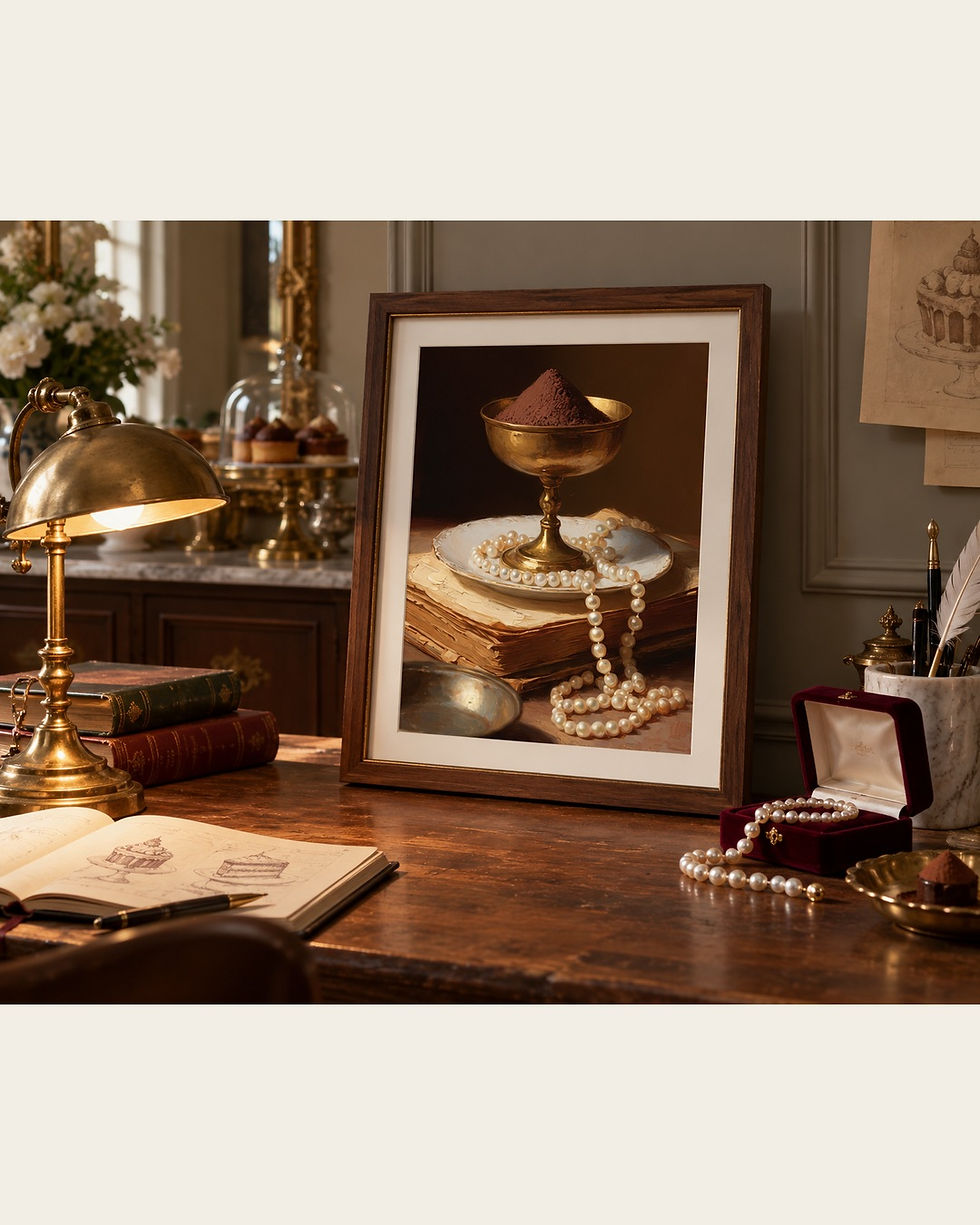
Writing-desk mockup: a closer setting for looking at the details.
Consider intimacy before making the image large
A detailed still life can be compelling at a scale that invites approach. The pearls reward close viewing, and the uneven paper edges contribute more when they can be distinguished. This does not prescribe a particular print size. It asks you to consider how far away you will normally be when encountering the work.
A wall beside a reading chair, a bedroom corner, or a small stretch above a desk may suit that kind of attention. A tall, distant wall may emphasize the cup’s silhouette while making the beads much less noticeable. Both are possible experiences, but they are different. Choose the one that drew you to the artwork in the first place.
Mark the proposed frame’s outline with paper and sit in the relevant chair. If it is a desk setting, test the view while seated at the desk as well as while entering the room. Include any mat and frame width in your measurements. The finished object occupies more wall space than the image alone, and that outer boundary will help determine whether the setting feels intimate, emphatic, or unnecessarily crowded.
Choose materials that answer the painting gently
The artwork contains plenty of decorative interest already. A frame can echo its warmth without trying to become a second golden cup. Consider the relationship between the frame finish, the dark background, and the room’s existing metal and wood tones. A warm wood profile or a restrained metallic finish would create different boundaries around the same image.
The bedroom mockup places the print beside a lamp and layered bedding. The pale textiles answer the pearls and paper, while the surrounding wood gives the dark ground a sympathetic neighbor. This is a useful example of connecting materials through broad qualities rather than matching every color precisely.
If you are deciding how to turn the printable artwork into a finished piece, our guide to framing printable wall art provides a practical route through the choices. Check the current Etsy listing for the available files before committing to a size. These room views are mockups: they illustrate presentation and placement, rather than documenting an included frame, a particular paper, or a fixed product dimension. Your own samples and measurements should settle those decisions.

Bedroom mockup: the artwork shown beside furniture and lamplight.
Pair it with a different kind of stillness
This image has a concentrated vertical structure. The cup rises above the plate; the pages support it; the pearl strand brings the eye downward again. A companion artwork can offer a more open rhythm, perhaps a low bowl of fruit or a vessel surrounded by a larger area of unoccupied background.
Keep one connection visible. Cream-colored highlights might link the pair, or both images might use a dark brown ground. The second artwork does not need jewelry, books, or golden objects to belong. In fact, changing the subject may help the first painting keep its particular character.
The library mockup shows the print in a setting of deeper walls, books, and leather furniture. Within that context, the pearls create small points of contrast that remain readable from a distance. If you are planning a pair, use our guide to arranging two still lifes together to think about spacing and visual weight. Look at the combined arrangement, then ask whether each work still offers a distinct reason to move closer. A successful pairing makes that second look possible rather than using all its energy in one coordinated first impression.

Library mockup: the artwork shown against a deeper interior palette.
Leave the owner of the objects unnamed
Part of the scene’s appeal is that we cannot settle its story. The pearls could suggest an evening’s preparation, a remembered person, or simply an appreciation of how beads catch light. The pages could feel scholarly to one viewer and personal to another. The painting leaves those associations available without confirming them.
Living with that openness can be more rewarding than assigning every object a fixed meaning. You might first notice the gold, then return another day to the paper’s irregular edge. The small arrangement continues to offer different entrances, even after its overall shape becomes familiar on your wall.
If this intimate mood feels right for your space, view Pearls Around the Golden Dessert on Etsy. Review the current listing details and imagine the finished frame at the distance you will actually see it. Give the beads room to remain small, the shadows room to remain deep, and the objects permission to keep something of their story to themselves. That unclaimed space is part of what allows the image to become personal.
Written by Havenest Studio


Comments