Matte, Glossy or Fine Art Paper: Which One Should You Choose?
The same artwork can feel quiet on one sheet and dramatic on another. A pale sky may sit gently against a matte surface, while a darker image can invite a little sheen. Paper becomes part of the picture before the frame ever reaches the wall.
For a painterly print, smooth matte is a sensible first sample. But fine art paper is not a third finish beside matte and glossy. It can include both.

In this guide
1. Understand what the paper labels mean
Matte and glossy describe finish; smooth and textured describe surface character. You can have smooth matte paper, textured matte paper or smooth paper with a visible sheen. These labels answer different questions.
Fine art paper usually describes a product range developed for art reproduction or photographic printing, with particular materials and coatings. It does not specify one appearance. Hahnemühle's Glossy FineArt collection, for example, includes satin, pearl and high-gloss surfaces. The company also has separate smooth and textured matte ranges.
The practical comparison is between actual papers, rather than three mutually exclusive labels:
Paper option | A useful starting point when… | What to check |
|---|---|---|
Smooth matte | You want a restrained surface without a glossy sheen | Shadow detail and the paper's white tone |
Textured matte | You want visible paper character | Whether texture competes with delicate detail |
Glossy | You enjoy a reflective, photographic presentation | Reflections at the intended viewing angle |
Satin, pearl or luster | You want some sheen between matte and high gloss | The exact sample; names vary between ranges |
Fine art paper | You want to choose specific fibers, coating and surface qualities | Its actual finish, specifications and printing compatibility |
Ask for the manufacturer and full paper name. “Premium paper” leaves too much to guesswork.
2. Start with matte for a quieter surface
A matte surface is a useful starting point when you want attention to stay on the image rather than a pronounced reflection. Canon describes its Pro Premium Matte paper as a smooth, warm-white option without a reflective sheen. That is a specification for one paper, not a description of every matte sheet.
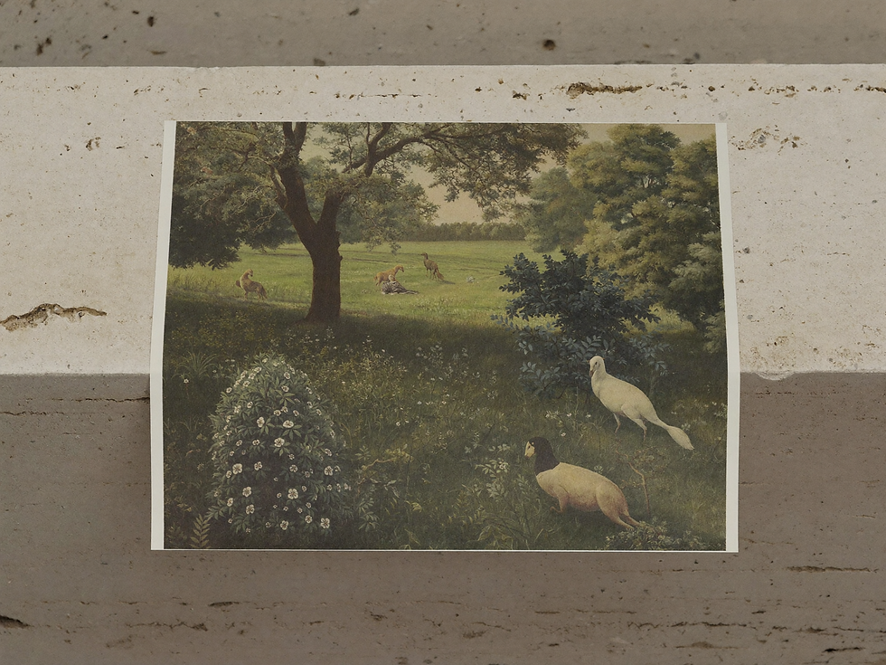
For a soft landscape, an understated still life or a muted portrait, my first sample would usually be smooth matte. This is an aesthetic recommendation: the restrained surface can sit comfortably with painterly imagery and a room built around wood, linen and subdued color.
Matte does not automatically mean rough, dull or low quality. Within the category, some papers are smooth and others noticeably textured. A textured surface may add character, but it also places a physical pattern beneath the printed image. If the artwork contains delicate faces, fine branches or small architectural details, compare those areas carefully.
Nor does matte paper solve every reflection problem. Glass or acrylic in front of the print can still reflect a window or lamp. When glare is the concern, evaluate the complete framed arrangement from the sofa or doorway where you will actually see it.
3. Consider glossy, satin and luster
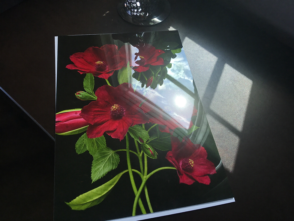
Glossy paper deserves consideration when you like a polished, photographic presentation. Its sheen is part of the intended look. For artwork built around strong tonal contrasts or saturated color, compare a glossy sample with matte rather than assuming one will be more faithful.
Reflective surfaces make viewing position matter more. A paper that looks pleasing on a counter may catch an unwanted reflection opposite a window. Examine it upright and flat, from your usual viewing positions.
Satin, pearl and luster offer alternatives worth sampling if high gloss feels too pronounced. Hahnemühle places satin at the subtler end of its gloss range and pearl in the middle. Treat those terms as clues, not exact equivalents across manufacturers: a paper's actual surface is more useful than its label.
There is no need to select glossy just because an image is colorful, or matte just because it depicts an old painting. The successful pairing depends on the paper, ink, image and lighting together. A small comparison will tell you more about your preference than a promise that one finish always produces “better colors.”
4. Choose fine art paper by its actual specifications
If you are considering an upgrade, identify what you want it to change. Is it the paper's texture, its white tone, its handling feel or a documented material specification? A higher price is easier to evaluate when you can name the difference that matters to you.
Read the product sheet for fiber composition, surface, weight and thickness. Weight in grams per square meter, or gsm, describes mass per area; it is not a direct thickness measurement. Do not assume two papers with the same gsm will feel identical or fit the same home-printer feed path.
Also distinguish the stability of the sheet from the permanence of the finished image. “Cotton,” “acid-free” or “fine art” should not be treated as a blanket promise that printed colors will never fade. Canson's print-permanence test report identifies particular paper-and-ink combinations and display conditions. A result for one combination does not certify every print carrying a similar label.
Ask which paper and ink system the service uses and what evidence supports any longevity claim. Expect more than “archival quality.”

5. Match the paper to the artwork and the room
Begin with the part of the image you care about most. In a pale landscape, that might be the gentle distinction between cloud and sky. In a candlelit still life, it might be the separation between several dark objects. Pick those details before comparing papers so your decision has a clear purpose.
For a muted countryside scene, compare smooth matte with a lightly textured option. For a portrait with finely described skin or clothing, begin with a smooth surface. For a dramatic night scene, include a satin or glossy sample. These are starting points for comparison, not rules about what each genre must use.
Consider scale as well. A small print invites close inspection; a large piece may be seen mostly from across the room. Use our guide to choosing the right print size for your wall before committing to an expensive enlargement. Judge the sample from the likely viewing distance, then step closer to check details.
Check daylight and evening lighting, including reflections from the proposed glazing. Keep the finished print out of direct sunlight where possible. The Library of Congress explains that light damage accumulates; choosing a particular finish does not remove the need to consider display conditions.

6. Check the file and the printing process
Paper cannot restore detail missing from the source file. Before comparing finishes, check the pixel dimensions against your intended print size. Our guide to 300 DPI versus 150 DPI explains why resolution needs to be considered alongside size and viewing distance.
The paper must also suit the printing process. At home, confirm that the sheet is approved for your printer technology and that its thickness, size and loading requirements are supported. A paper intended for inkjet printing should not be assumed suitable for a laser printer. At a print shop, ask which exact paper will be used rather than supplying an unfamiliar sheet without checking compatibility.
Color handling matters too. Epson's explanation of color-control technology describes how printable colors and ink amounts depend on the media and printer. Ask the service whether it uses an appropriate profile and whether automatic image correction will be applied. You want to know which changes are being introduced.
Finally, confirm image dimensions and cropping. A beautiful paper cannot rescue a composition cut to the wrong shape. Read our wall-art aspect-ratio guide and check the preview before ordering.

7. Order a useful sample and make the final choice
If the final print is important or expensive, order the same image on two shortlisted papers through the intended print service. Keep image size, cropping and requested corrections consistent, while allowing the printer to use the correct settings for each paper. Include both a pale area and a dark area in the comparison.
Ask for a small full-image proof to judge the overall effect. If you are planning a large print, a separate detail printed at the final reproduction scale can help you assess texture and sharpness. A tiny version of the entire artwork cannot show exactly how its smallest details will look enlarged.
Place the proofs where the artwork will live and compare them in normal daytime and evening light. Look for visible detail, pleasing paper white and manageable reflections. If possible, view them behind the intended glazing. Choose the version you prefer there, rather than the one that looks most dramatic under the print shop's lights.

My practical recommendation: start with smooth matte for a restrained painterly presentation; sample satin or glossy when you want more sheen; choose a specific fine art paper when its material or surface gives you a difference you value. Then explore Havenest's printable artwork on Etsy and check the individual listing's file and size details before ordering your print.
Sources and review basis
This guide is based on desk research of manufacturer documentation and conservation guidance, reviewed October 2, 2026. The paper pairings are editorial recommendations; no physical comparative testing was performed for this article.
Written by Emma for Havenest.



Comments