Flowers Beside the Pears: Finding a Room’s Everyday Color
The flowers catch your eye first. Red and orange blooms rise from a patterned ochre vase, with blue notes and foliage between them. Then the rest of the table comes into view: green pears in a bowl, a bottle, a round loaf, and a blue cloth extending toward the foreground.
Flowers Beside the Pears feels welcoming because its brightness has company. The bouquet does not occupy a ceremonial space of its own. It shares the table with food, fabric, and the light coming from a window at the left. The scene suggests the pleasure of bringing something beautiful into an ordinary day.
For a room that already contains several colors, this Havenest artwork offers a useful example. Harmony can come from relationships between distinct things, rather than from reducing everything to a single matching shade.
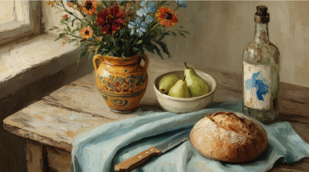
Flowers Beside the Pears. Artwork by Havenest.
In this article
Flowers set the height; pears establish the table
The bouquet creates the painting’s highest concentration of small shapes. Petals, leaves, and stems interrupt one another, producing a lively outline above the vase. Below it, the vessel gathers that complexity into a broader ochre form. Its patterned surface keeps the transition interesting: the flowers do not simply stop at the rim.
The pears occupy a lower, more compact area beside it. Their rounded green bodies are easier to read than the bouquet’s many fragments, and the pale bowl gives them a distinct boundary. This change in visual density matters. After looking through the flowers, the eye can settle on a small group of clearly separated forms.
Together, the two arrangements establish different speeds of attention. The bouquet invites wandering; the fruit allows a pause. Neither would feel quite the same without the other nearby. It is a useful reminder that a still life can be animated without depicting any action. Changes in height, shape, and density supply the movement. When looking at the complete artwork, allow yourself to follow those changes before deciding which object is the subject. The painting makes room for several centers of interest.

The artwork becomes part of a furnished wall.
The blue cloth connects the foreground
The blue cloth runs through the lower part of the composition in broad folds. It links the area beneath the vase and bowl to the round loaf closer to us, providing a continuous color across objects that are otherwise quite separate. Its movement is softer than the tabletop’s edges and more expansive than the small blue details elsewhere.
That makes it a particularly useful guide for the eye. Follow one fold and the arrangement begins to feel connected rather than assembled from unrelated items. The cloth also gives the warm ochre vase and bread a cooler neighbor, making their warmth more noticeable. Color works through proximity here: each passage changes the way we read the next.
You can explore this without specialized vocabulary. Start with the strongest continuous color and ask where it takes you. Then identify the smaller echoes that bring you back. Our guide to reading a still life develops this kind of direct observation. In Flowers Beside the Pears, the cloth is an especially generous place to begin because it offers both a clear shape and a route into the rest of the painting.
A window makes familiar objects feel newly available
The window at the left establishes the table’s relationship to a larger room. We do not see enough to describe that room fully, and there is no need to invent it. The visible opening and the light across the arrangement provide a sufficient setting. Objects appear gathered near a place where daylight can reach them.
The wall and tabletop show variation rather than uniform, polished surfaces. These changes soften the space around the bouquet. They also prevent the brightness of the flowers from making the scene feel detached from everyday use. The loaf and bottle carry a similar effect: recognizable things share the light with the more decorative vase.
One possible reading is a table prepared by someone who enjoys both flowers and a simple meal. Another is a collection of ordinary objects noticed by chance. Neither is established history; both arise from the arrangement’s domestic familiarity. The writing-desk mockup demonstrates how that familiarity can travel. Near books, a lamp, and real flowers, the framed image becomes another small concentration of color in a room already being used. It does not require the viewer to recreate the scene to understand its appeal.

Writing-desk: a closer setting for looking at the details.
Start your room palette with one existing object
If the artwork appeals to you, look around your room before buying anything to match it. Perhaps there is already a green cushion, a blue ceramic bowl, or wood with a warm golden tone. One of those things can become the first connection. You do not need a complete new palette to make the painting feel considered.
The blue cloth is a strong candidate for a larger textile echo because it occupies a broad area in the image. The green pears could connect to a smaller object or to foliage. Ochre and warm brown may already be present in a wooden table or cabinet. Choose the relationship that exists most naturally, then allow the remaining colors to stay inside the artwork.
This approach leaves the room flexible. Flowers change, books move, and a table is cleared for something practical. The painting can continue to belong because its connection rests on a few stable colors rather than a fixed arrangement of accessories. Step back and check whether the image remains visible as an artwork in its own right. If every neighboring object repeats it, remove an echo or two until the frame has some independence.
Let the flowers belong beyond the kitchen
A kitchen or breakfast area gives the loaf and pears an obvious context. Yet a bedroom can respond just as strongly to the painting’s blue cloth, soft green fruit, and warm vase. Subject matter is one route into a room; color and visual rhythm offer others.
The bedroom mockup places the print on wooden furniture beside a lamp and layered bedding. The flowers inside the picture bring a concentrated vertical gesture to a comparatively low arrangement. This is a useful relationship to notice when considering your own wall or bedside area. Ask what shape is missing from the setting, as well as what color might fit.
A frame should help the image establish its boundary without swallowing the smaller details. Test possible finishes beside the actual print or a reliable sample, considering both daylight and evening illumination. The practical steps in our printable wall-art framing guide can help you connect file choice, printed image, and frame. Treat the room views as styling illustrations. They show possible relationships, while your wall dimensions and the listing’s current file information should guide the final size.

Bedroom decor: the artwork shown beside furniture and lamplight.
Give a lively painting a composed companion
When choosing a second artwork, consider what Flowers Beside the Pears already contributes: several colors, many small flower shapes, and a broad sweep of fabric. A companion does not need to bring the same level of activity. It might offer a single vessel, a restrained group of fruit, or a larger area of open background.
A shared blue or warm ground can connect the works while their compositions remain distinct. You might also pair them through the objects’ scale rather than their exact palette. Two still lifes in which the main arrangement occupies a similar proportion of the picture can feel related even when one is brighter and more intricate.
Our guide to pairing still-life art on one wall explains how spacing and proportion contribute to that conversation. Check the pair as a whole from the doorway, then move close enough to enjoy each image separately. In the library mockup, this artwork holds its place against a darker setting through the light cloth and bright bouquet. That contrast may be more useful than finding a wall that repeats its pale background exactly.

Library decor: the artwork shown against a deeper interior palette.
Make space for the things you already enjoy
A bowl of pears and a vase of flowers suggest different kinds of daily pleasure. One will become part of a meal; the other changes as its blooms open and fade. In the painting, both remain available at once. Their shared table makes beauty feel connected to ordinary life rather than reserved for a special occasion.
That is the quality worth carrying into a room. A framed image can join a reading lamp, a favorite cup, or a chair already shaped by use. It need not announce a complete redesign. Sometimes it simply makes the colors and objects already there feel more consciously seen.
If this combination belongs in your home, explore Flowers Beside the Pears on Etsy, where you can review the current download details. Begin with the intended spot, imagine the finished frame, and choose the relationship that matters most to you: the flowers’ brightness, the pears’ familiar shapes, or that broad blue cloth carrying the whole arrangement toward the edge of the table.
Written by Havenest Studio


Comments