Bedroom Wall Art Ideas for a Calm Space
A bedroom is one of the few rooms in a home that does not need to impress anyone. It can be quieter, more personal, and less styled for an audience. That is precisely why the artwork here matters: it enters the private rhythm of waking, reading, dressing, and returning to rest.
The best bedroom wall art ideas do more than solve a blank wall. They lower the visual volume of the room. A softened horizon can make the wall feel deeper; an intimate landscape beside a chair can create a pause; one well-scaled painting above the bed can make everything beneath it feel settled.
The short answer: choose the mood before the subject, keep the palette related but not perfectly matched, give the artwork enough scale to belong to the bed, and leave breathing room around it. Calm comes from hierarchy—not from making every object pale.
In This Article
Begin with the Feeling of the Room
Calm is not a single aesthetic. One person rests best in an airy room of chalk, pale oak, and cool morning light. Another needs a warmer enclosure of mushroom walls, walnut, wool, and low amber lamps. Before searching for bedroom wall decor, decide which kind of quiet you are trying to create.
For a light, open bedroom, look toward misty meadows, soft coastal horizons, pale botanical studies, or countryside paintings with generous sky. For a room that should feel cocooning, choose woodland edges, fields at dusk, aged florals, or vintage landscapes with olive, umber, cream, and faded gold.
Do not begin by typing the color of your duvet into a search bar. Begin with a sentence: “I want this room to feel like the first hour of morning,” or “I want it to feel sheltered from the rest of the day.” A clear emotional direction makes the visual decisions much easier.
This approach is especially useful in an Airbnb bedroom. Guests may not share the owner’s personal taste, but they understand atmosphere immediately. One readable, restful image often creates more welcome than a collection of generic signs or decorative filler.
Choose Art with a Softer Visual Rhythm
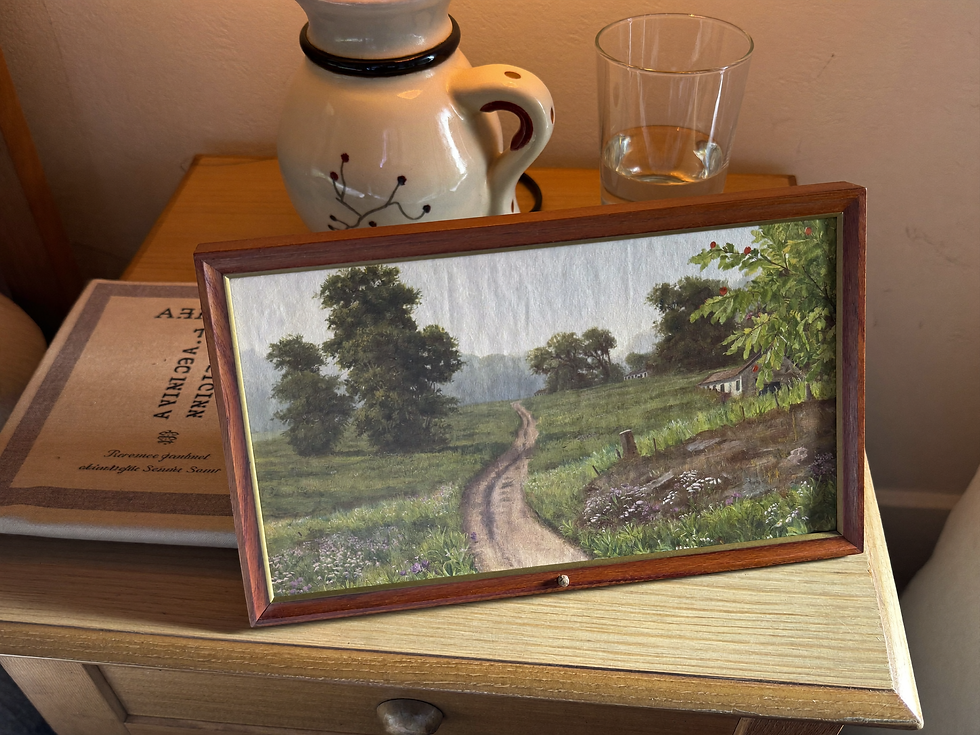
Bedrooms usually benefit from movement that unfolds slowly. A path disappearing into trees, a low horizon, a distant hill, or a calm shoreline gives the eye somewhere to travel without creating urgency. The composition can contain detail, but it should not ask you to process every corner at once.
This is one reason vintage landscape bedroom art works so naturally. Atmospheric depth lets the mind move beyond the wall, while softened edges keep the image from becoming visually sharp. A landscape can be spacious without feeling empty and narrative without demanding an explanation.
Look for a clear hierarchy: one darker tree against a pale field, a path leading toward light, or a horizon held beneath a wide sky. Avoid scenes where every flower, cloud, figure, and building has the same intensity. When all details speak at once, the image becomes decorative noise.
Misty meadows: private, soft, and spacious—especially good for pale neutral bedrooms.
Countryside paths: quietly narrative, with enough movement to reward repeated looking.
Coastal horizons: open and breathable, useful in smaller rooms or cooler palettes.
Pastoral fields: warm and grounded, particularly beautiful beside oak, walnut, and linen.
Vintage florals: more intimate and enveloping; choose softened contrast rather than brilliant color.
Calm water scenes: reflective and horizontal, often well suited to the wall above a bed.
Use Color to Support Rest
A calm bedroom palette needs relationship, not duplication. If the walls, bedding, rug, and artwork are all the same beige, the room can feel less peaceful than strangely unfinished. The eye needs a few tonal steps in order to understand depth.
Use the artwork to introduce one gentle note the room does not already have. Dusty blue can cool cream and honeyed wood. Muted sage can give life to oatmeal and taupe. Weathered brown can steady pale linen. A small faded rose or muted gold can keep a neutral room from feeling emotionally cold.
Borrow from the atmosphere of the image rather than its most obvious color. In a meadow painting, the pale sky may offer better room colors than the grass. In a coastal scene, the sand, cloud, or shadowed water may be easier to repeat than blue.
If the room already follows warm ivory, dusty blue, and muted sage, our guide to a warm neutral living room explains how undertone, material, and light keep a restrained palette from becoming flat. The same principles translate beautifully to bedrooms.

Get the Scale Right Above the Bed
The bed is usually the strongest piece of furniture in the room, so artwork above it must feel connected to that visual weight. A small frame floating high on a wide wall rarely feels calm; it feels unresolved.
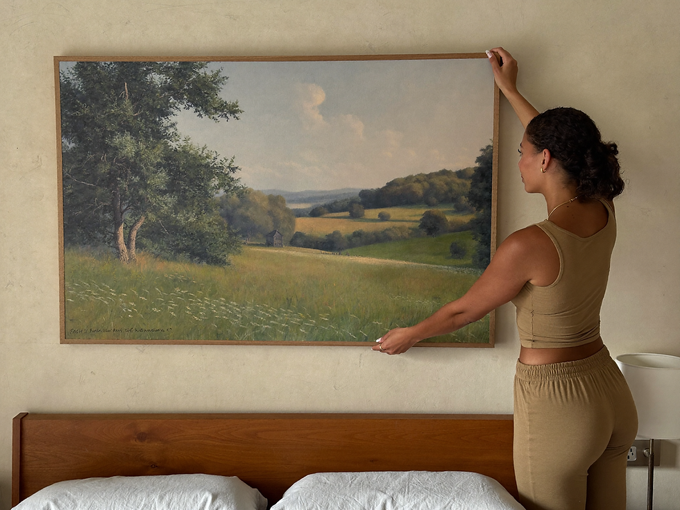
As a starting point, let a single artwork or grouped arrangement occupy roughly two-thirds to three-quarters of the headboard width. Treat that as a relationship rather than a law. A very tall headboard may need the artwork slightly narrower, while a low platform bed can support a broader horizontal piece.
For a queen or king bed, one large horizontal landscape often creates the quietest result. Its long line follows the headboard and allows the horizon within the image to extend the room. If you prefer a pair or trio, keep the gaps consistent and make sure the group reads as one composition from the doorway.
Hang the art close enough to belong to the bed zone, but allow practical clearance for pillows, a high headboard, and the movement of making the bed. Tape a paper outline to the wall for twenty-four hours. Look at it while standing, sitting, and lying down before drilling.
For more help judging furniture-to-art proportions, the guide to large horizontal wall art above a sofa uses the same underlying principle: artwork should relate to the object beneath it, not to the entire wall in isolation.
Choose What You Want to See First and Last
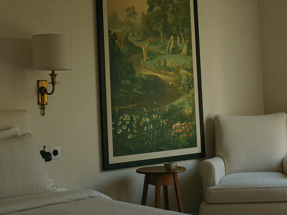
Living-room art participates in conversation. Bedroom art participates in repetition. You may see it in the half-light before sleep and again before the day has fully begun. Emotional resonance therefore matters more here than trend value.
Choose a piece that gives you a feeling you are willing to meet repeatedly. Perhaps it recalls countryside air, a road taken years ago, the stillness before rain, or simply a landscape that seems to contain enough room for your thoughts.
If mist and quiet horizons are what you return to, continue with our Misty Meadow art guide. It looks more closely at the way softened distance changes both an image and the pace of the room around it.
The right bedroom artwork does not ask for attention every time you enter. It becomes the place your attention knows how to rest.
Frame with Quiet Intention
A frame is the boundary between the image and the room. Pale oak feels relaxed and contemporary; walnut gives a light landscape a firmer edge; antique gold brings warmth and old-world character; a slim black frame can add useful structure to a modern bedroom.
Warm-white matting gives a small printable bedroom art piece architectural presence and separates it from a similar wall color. For a large horizontal canvas, skip the mat and allow the image to occupy more of the surface. Avoid bright optical white beside weathered cream—it can make the art look unexpectedly dull.
Matte or lightly textured paper is often the most forgiving choice for bedrooms because it reduces glare from windows and lamps. Canvas can add a painterly surface, but inspect the crop carefully: wrapping part of a horizon around the stretcher edge can change the balance of the composition.
If printable files are new to you, How Digital Wall Art Works explains ratios, print sizes, paper choices, and the simple path from download to finished frame.

Create Calm without Making the Room Empty
Calm does not mean bare. A bedroom can hold books, textiles, keepsakes, and signs of daily life while still feeling restful. The difference is hierarchy: one piece leads, a few objects support it, and some surfaces are allowed to remain quiet.
Let the artwork connect to two or three materials already in the room—a linen throw, ceramic lamp, oak table, wool rug, or faded brass detail. Stop before every color in the painting receives a matching accessory. One echo feels intentional; five echoes feel themed.
Keep one visual anchor: a confident work above the bed or a smaller intimate piece in the reading corner.
Lower nearby objects: lamps and branches should not interrupt the important horizon or figure in the painting.
Leave one wall quieter: negative space helps the main artwork retain emotional weight.
Use pairs sparingly: symmetry can soothe, but too many matching objects make a personal bedroom feel staged.
Review from the bed: the composition should make sense from where the room is actually lived, not only from the doorway.
Printable wall art makes testing easier. You can compare two sizes with paper templates, print locally on matte or fine-art paper, and choose a frame that suits the actual light rather than accepting a fixed warehouse format.
Bedroom wall art should not fight for attention. It should become part of the room’s quietness: a little depth above pale linen, a remembered horizon beside the lamp, a story that waits without insisting.
Choose the piece that helps the room exhale. Let the scale feel confident, the frame feel honest, and the surrounding objects know when to stop.
Explore the Havenest printable art collection for calm bedrooms, soft neutral interiors, and rooms that deserve a little more soul.
Words and visual direction by Havenest.


Comments