How to Create a Warm Neutral Living Room That Never Feels Flat
A warm neutral living room should never feel like a room from which color has been removed. At its best, the palette is full of small differences: chalk beside oatmeal, pale oak beside walnut, stone beside linen, and one landscape holding a darker note at the center.
Those differences are what make the room feel calm rather than blank. When color becomes quieter, proportion, texture, light, and art have to work harder—and the result can feel far more personal than a perfectly coordinated beige scheme.
The short answer: choose one warm undertone, repeat it across several natural materials, add a small amount of dark contrast, and let the wall art carry a real point of view. A neutral room needs restraint, but it also needs something worth remembering.

In This Article
Start with Undertone, Not “Beige”
The word beige covers an enormous range: pink beige, green-gray stone, yellowed linen, mushroom, camel, taupe, and cream. Put several of them together without noticing the undertones and the room can feel unsettled even though every individual item appears neutral.
Begin with the fixed surfaces. Look at the floor, fireplace stone, large rug, and any timber that will remain. If the oak leans honeyed, a softly yellow or red-based neutral may feel connected. If the stone carries a green-gray cast, a muted mushroom or warm greige can bridge the two.
Benjamin Moore’s guidance on neutral paint colors makes the same practical point: undertones shape the mood, and lighting changes how those undertones appear. Sample paint on more than one wall, then look at it in morning light, late afternoon, and under your lamps before committing.
Do not force every surface into the same temperature. One cooler note can make the warm palette more convincing: a blue-gray sky in a painting, pale limestone, or a washed charcoal textile. The aim is relationship, not uniformity.
Foundation: soft ivory, warm greige, mushroom, sand, or pale taupe.
Middle tones: oatmeal linen, natural oak, camel wool, aged paper, or muted clay.
Anchors: walnut, bronze, deep olive, charcoal, or the darkest tone in the artwork.
One release note: a cooler gray-blue, chalk white, or faded green to keep the room from becoming heavy.

Build Depth Through Natural Materials
A warm neutral room is read through touch before color. Linen absorbs light differently from wool. Matte plaster has quiet movement that flat painted drywall does not. Wood grain, handmade ceramic, aged brass, and woven fiber create shadows on a small scale, which is why a restrained palette can still feel rich.
Choose three or four material families and let them repeat. A linen curtain can echo a linen cushion without matching exactly. Oak may appear in the frame, side table, and shelving, while stone returns in a lamp base and a small bowl. Repetition creates coherence; variation keeps it alive.
Avoid giving every object the same soft, rounded finish. Bouclé sofa, nubby rug, boucle chair, and cloud-shaped table can quickly turn “cozy” into visual fog. Pair softness with something firmer: crisp linen, a straight-edged timber frame, a slab of stone, or a lamp with a slender metal stem.
Age helps too. A slightly worn wooden stool or an imperfect ceramic vessel interrupts the showroom feeling and gives the new pieces somewhere to belong. The object does not need to be precious. It needs a surface that records light and use.
Think of texture as the room’s punctuation. Large, quiet fields—walls, sofa, curtains—create the sentence. Wood grain, woven fibers, and aged metal place the pauses.

Use Quiet Contrast to Give the Room Structure
Many neutral living rooms feel flat because every value sits in the middle. The walls are pale, the sofa is pale, the rug is pale, and the accessories differ by only a fraction. Calm does not require the absence of contrast; it requires contrast that has been placed with care.
Use the darkest note in two or three locations. A walnut frame can speak to a side table and one deep brown book spine. A blackened bronze lamp can relate to the shadow line beneath a console. These small anchors guide the eye around the room and make the lighter surfaces feel intentional.
Scale is another form of contrast. One substantial artwork above the sofa often feels quieter than nine small pieces competing for attention. A large ceramic vessel can create more presence—and less clutter—than a collection of tiny objects spread across every surface.
If you prefer a gallery wall, keep one organizing rule: a shared frame family, a consistent gap, or a repeated horizon line. The images can vary, but the architecture of the grouping should remain legible.
Let Light Change the Palette
Neutral colors are unusually responsive to light. Cream may look fresh at noon and golden by evening; mushroom can move from gray to brown as the sun crosses the room. This change is not a flaw to eliminate. It is part of what gives a warm neutral living room its depth.
Start by observing the natural light rather than immediately correcting it. In a bright south-facing room, sheer linen can reduce glare and let subtle wall color remain visible. In a darker room, reflective surfaces used sparingly—a glazed lamp, pale stone, or small mirror—can return light without making the space glossy.
For evening, create several low pools of light. A floor lamp near the sofa, a table lamp beside the reading chair, and a small directional light near the artwork will produce more atmosphere than one strong overhead fixture. Keep bulb color consistent so one corner does not turn blue while another turns amber.
Light the art, but do not flatten it. A soft wash from above or the side allows texture and tonal shifts to remain. Direct glare on glass can erase the very horizon the room was built around.
Give Artwork Emotional Weight
In a colorful room, art can be one voice among many. In a restrained room, it often becomes the emotional center. That does not mean choosing a dramatic statement for its own sake. It means selecting an image with enough atmosphere to hold attention after the color match has been noticed.
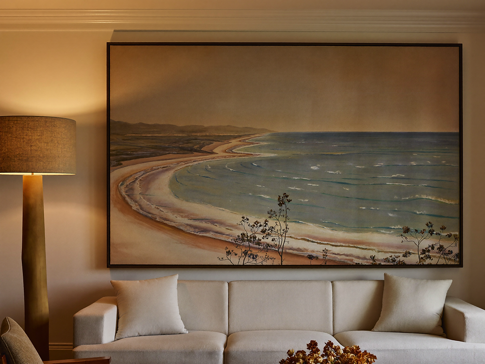
Vintage landscapes work especially well because they contain tonal variation within a familiar subject. A meadow brings soft movement, an orchard introduces rhythm, and a distant coastal horizon opens the wall. Faded greens, umber, smoke blue, and weathered cream sit naturally beside warm timber and linen without disappearing into them.
Choose atmosphere before palette. If a painting makes the room feel larger, quieter, stranger, or more reflective, it is doing useful work. If it merely repeats the cushion colors, it may decorate the wall without giving the space a center.
Scale the artwork to the furniture, not to the empty wall in isolation. Above a sofa, a wide landscape should feel connected to the seating group beneath it. For a narrow return wall or reading corner, a smaller matted work can become intimate because the viewer is able to approach it.
Our guide to large horizontal wall art above a sofa explains how to judge that relationship before framing. If you want the palette to feel even softer, the quiet beauty of misty meadow art shows how fog, negative space, and a low horizon can settle a room.
Frame with enough structure to separate the image from the wall. Pale oak keeps the effect light, walnut adds a confident edge, and antique brass introduces history. Avoid matching the frame perfectly to every timber in the room; a small difference makes the composition feel collected.

Edit the Room, Then Leave Space to Live
The final layer in a warm neutral living room is subtraction. Once the major pieces are in place, remove the objects that only repeat what has already been said. Three similar beige vases do not create more calm than one beautiful vessel; they create a beige collection.
Stand at the doorway and look for hierarchy. What do you notice first? Where does the eye rest next? Ideally, the artwork and one architectural or furniture element lead, while smaller objects support them. If every surface asks for equal attention, the room needs editing.
Keep: objects with tactile character, useful books, lamps that improve the evening, and pieces tied to memory.
Move: small accessories that compete with the artwork or interrupt a strong horizon line.
Add only if needed: one dark anchor, one living branch, or one practical textile that changes how the room feels to use.
Leave empty: part of the coffee table, the wall around the art, and at least one quiet line of sight across the room.
Then live with the room before changing it again. Morning coffee, conversation, open curtains, and a book left on the table will add the irregularity no styling exercise can manufacture.
A warm neutral interior succeeds when it feels composed but not finished. Its colors belong to one another without becoming identical; its materials invite touch; its light changes; and its artwork keeps a small part of the room unresolved.
Neutral is not the absence of a point of view. It is a quieter way of holding one.
For a broader look at restraint, natural materials, and rooms with space to breathe, continue with our Quiet Luxury Home Decor guide.


Comments