A Painting as a Place to Rest
Some paintings invite detailed examination, while others require little attention.
You look at them and the room becomes a little quieter. The eye moves into a field, follows a pale road, rests at the line of distant hills, or stays for a moment where light gathers on water. Nothing dramatic needs to happen. The painting simply gives attention somewhere gentle to go.
That quality is easy to underestimate. In a home filled with screens, messages, objects, and decisions, calming landscape art can act almost like visual negative space. It does not empty the room. It gives the room a place to settle.
A painting cannot manufacture peace, of course. But composition, distance, color, scale, and light can change the pace at which we look. And sometimes that change of pace is exactly what a room needs.

In this article
01. Why some paintings feel like a place 02. The eye needs somewhere to land 03. Distance creates breathing room 04. Soft light lowers the visual volume 05. Color can calm without becoming bland 06. Scale matters more than quantity 07. Choose art for the pace you want in the room
Why Some Paintings Feel Like a Place
A landscape painting can do something that a purely decorative object rarely does: it can create psychological depth.
A wall is physically flat, yet a painted road can disappear into trees. A horizon can recede beyond the frame. A river can pull the eye around a bend that does not actually exist. We know the surface is canvas, paper, or a digital print, but perception still accepts the invitation to travel.
This is why certain paintings can feel less like an object on a wall and more like a small opening in the room.
The effect does not require realism. In fact, a loosely painted landscape can sometimes feel more spacious because it leaves interpretation unfinished. A softened tree line, a broken brushstroke, or a pale area of mist gives the viewer room to complete the scene mentally.
That participation matters. When everything in an image is aggressively defined, the eye has more information to process. When some forms are suggested rather than explained, attention can move more slowly.
This is one reason quiet landscapes return so naturally to bedrooms, reading corners, living rooms, and other spaces where the goal is not stimulation but presence.
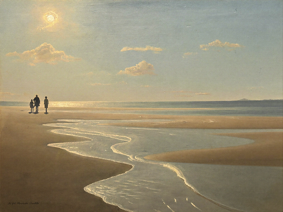
The Eye Needs Somewhere to Land
A calm room still needs a focal point.
Without one, minimal interiors can become visually vague. The eye keeps searching because nothing has enough weight to hold attention. Adding more accessories rarely fixes that problem; it often creates more movement instead.
A single painting with a clear center of gravity can do more.
That center does not have to be a person, building, or strong contrast. It might be a patch of illuminated meadow, a tree at the edge of a field, a quiet horizon, or the place where a path turns. What matters is that the composition gives the gaze a destination.
Once the eye has somewhere to land, the rest of the room can become simpler.
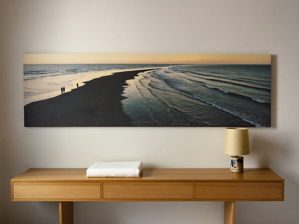
This is especially useful above a sofa, bed, console, or reading chair. The painting visually gathers the furniture beneath it, while the furniture gives the artwork physical context. Instead of several unrelated decorative gestures, the wall begins to read as one composition.
A restful artwork is not necessarily empty. It is simply organized in a way that does not ask the eye to chase too many competing signals.
Distance Creates Breathing Room
Distance is one of the most powerful calming devices in landscape art.
Painters have long used atmospheric perspective to make faraway forms lighter, cooler, softer, and less detailed. Hills lose contrast. Trees merge into masses. Roads narrow. Sky occupies more of the composition. The result is an image that seems to extend beyond its physical dimensions.
In an interior, that perceived distance can be remarkably useful.
A small room can feel less enclosed when the art contains an open horizon. A narrow wall can feel less rigid when a landscape pulls the gaze beyond it. Even a compact bedroom can gain a sense of mental space from a misty field or receding path.
The point is not to trick the eye into believing the room is larger. It is subtler than that. The painting introduces somewhere else for attention to go.
That “elsewhere” is part of what makes pastoral landscapes, seascapes, and distant hill scenes so easy to live with. They provide depth without adding physical clutter.

Soft Light Lowers the Visual Volume
Light can make a quiet subject feel dramatic or a dramatic subject feel tender.
For restful art, diffused light is especially effective. Morning haze, overcast skies, mist, and late-afternoon glow soften edges and reduce the hard contrast that makes an image feel visually loud.
This does not mean every calming painting needs to be pale. A dark woodland can still feel deeply restful if its tonal transitions are gradual and the light is controlled. Likewise, a golden field can remain soft if the brightest areas do not compete with every other element in the composition.
The emotional effect comes from hierarchy.
When one area glows and the rest supports it, the eye can settle. When every edge is sharp and every color is equally insistent, attention becomes fragmented.
Soft light also connects beautifully with real interiors because natural illumination changes during the day. A muted painting above a sofa may feel cool in the morning and warmer toward evening. The art participates in the room instead of looking exactly the same at every hour.
Color Can Calm Without Becoming Bland
Calm is not the same as beige.
A peaceful wall can include olive, blue-gray, faded rose, ochre, soft green, weathered brown, charcoal, or muted gold. What usually matters more is the relationship between colors: are they fighting for attention, or do they feel as though they belong to the same atmosphere?
Restricted palettes tend to feel restful because the eye has fewer abrupt transitions to resolve.
A painting might contain ten colors, but if they share a softened undertone, the image can still feel coherent. Vintage landscapes often do this naturally. Their greens may lean toward olive, blues toward gray, whites toward cream, and darks toward brown rather than pure black.
Those small shifts make the painting easier to integrate into a home.
Instead of matching the sofa exactly, look for one or two tones in the art that echo materials already present: the warmth of walnut, the gray of stone, the cream of linen, the green of a plant, or the patina of aged brass.
The room feels connected without becoming coordinated to the point of lifelessness.
Scale Matters More Than Quantity
When the goal is visual rest, one substantial painting often works better than many small ones.
A gallery wall can be beautiful, but it naturally creates multiple edges, frames, gaps, and focal points. That energy can be useful in a hallway or creative room. In a quiet living room or bedroom, however, a single large landscape may create a more settled effect.
The artwork needs enough scale to hold the wall.
Above furniture, that usually means thinking in relation to the sofa, bed, sideboard, or console rather than choosing a print in isolation. If the piece is too small, it can look stranded and invite additional objects to compensate. When the scale is generous, the wall often needs less around it.
This is one of the simplest ways to make a peaceful room feel intentional rather than sparse.
A large quiet painting gives atmosphere room to work.

Choose Art for the Pace You Want in the Room
The most useful question may not be “Does this painting match my decor?”
It may be: “What pace does this image create when I look at it?”
A crowded city scene might bring movement. A high-contrast abstract can bring tension and energy. A dark portrait can create intimacy. A distant landscape can invite the gaze outward and slow it down.
None of those effects is better than another. The right choice depends on the room.
For a workspace, a little visual energy may be welcome. For a living room used for conversation, an open landscape can make the wall feel generous without dominating it. For a bedroom, soft distance and low contrast can support the quieter rhythm of the space.
Notice your physical response before you analyze the style.
Do your eyes keep darting around the image, or do they settle? Does the composition feel compressed, or does it open? Does the color sharpen your attention, or soften it? Would you still want to look at the painting after the novelty of a new purchase has passed?
Those responses often tell you more than a decor label ever could.
Closing
A painting does not need to be silent to be restful. It needs to give attention a coherent path.
A horizon offers distance. Soft light reduces visual friction. A restrained palette keeps color in conversation. Generous scale lets one piece carry the wall instead of asking many objects to compete for it.
The result is not an empty room. It is a room with somewhere to rest.
And perhaps that is one of the most enduring reasons to live with art: not because every wall needs filling, but because sometimes a wall can hold a place we are glad to return to.
Final reflection
Notice the paintings you already linger over. The one that makes you stop scrolling, stand a little longer in a gallery, or look twice when you pass it at home may already be telling you what kind of visual rest you need.
Continue Reading
Continue with The French Landscape: How Forests, Fields, and Light Became Art, then read How to Read a Still Life: Five Questions.
If this is the kind of visual pause your room needs, explore Three Figures by the Tide as a printable art download on Etsy.
Words and visual direction by Havenest.


Comments