Vintage Home Decor Ideas That Still Feel Refined
Vintage rooms become interesting long before they become fashionable. Their appeal lies in the sense that objects have arrived gradually: a landscape found on a quiet afternoon, a chair kept because its proportions are right, a bowl whose glaze has softened through years of use. The room holds time, but it still belongs to the present.
The challenge is refinement. Vintage home decor can easily turn into a collection of signals—the carved frame, the patterned rug, the brass lamp, the stack of old books—each trying to prove the same point. A more considered interior lets age appear in measured places. It pairs history with clarity, giving every object enough space to be seen.
These ideas are less about recreating a particular decade than learning from older rooms: their depth of color, trust in natural materials, and willingness to let art carry atmosphere. The result should feel collected rather than costumed, comfortable rather than precious, and personal enough to improve with time.
In This Article
Refined Vintage Begins with Restraint
Start by deciding where age will be most visible. One substantial painting, an old timber cabinet, or a linen chair with a familiar silhouette can establish the mood. The rest of the room may stay quiet. When every surface performs vintage character, the eye has nowhere to rest and the pieces lose their individual presence.
Restraint also makes room for practical life. A clear tabletop, an open stretch of wall, and generous circulation keep a historic-looking interior from feeling heavy. Think of empty space as part of the composition. It allows patina to read as beauty rather than clutter.
A useful test is to remove the smallest decorative objects and look again. If the room still feels warm and complete, its structure is doing the work. The pieces you return can then be chosen for meaning, not simply for atmosphere.
In photographs, an abundant room can be seductive. In daily life, refinement is often felt through ease: a drawer that opens freely, a chair with space around it, and a painting that can be approached closely. Let the room work before asking it to perform.
Let Art Carry the Room’s Memory
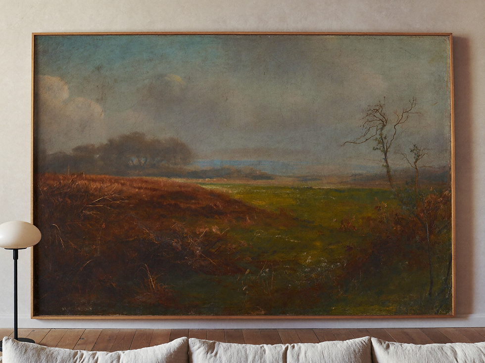
Art is often the most graceful way to introduce a sense of history. A vintage landscape, pastoral scene, or dark floral still life contains a world within the frame. Its worn palette and softened brushwork can make a new room feel anchored without asking the architecture to imitate the past.
Give the painting visual authority. Hang it where the eye naturally lands and keep nearby styling low and simple. A single work above a console or sofa usually feels more editorial than several objects gathered around it. In this setting, the frame is not an accessory; it is the threshold between the room and the painted story.
If the artwork has a strong atmosphere, resist matching it too literally. A stormy landscape does not require dark furniture, and a floral painting does not need a floral textile. Echo one tone or material, then allow the image to keep its mystery.

Mix Period Pieces with Clear Modern Lines
A room feels current when vintage pieces meet forms with quieter geometry. Place an ornate painting above a low, clean-lined console. Pair a turned-leg table with a plain linen chair. Let a classical profile sit beside a contemporary lamp made from stone or paper. Contrast keeps the room alert.
The balance need not be equal. One old piece can carry enough character for an entire corner, while the supporting furniture stays restrained. This is especially useful in newer homes, where forcing architectural history through mouldings and imitation finishes may feel less convincing than a few genuinely expressive objects.
Scale is more important than era. A large painting and a low sofa may belong to different decades yet feel inevitable together because their proportions agree. When the shapes relate, the timeline can remain pleasantly loose.
Repeated shapes can quietly bridge the difference. The curve of a nineteenth-century chair might answer the arc of a modern lamp, while the long horizontal of a contemporary bench steadies an older portrait. This kind of correspondence is subtle but persuasive.

Build a Palette from Faded Pigments
Vintage paintings offer sophisticated color maps. Look closely at an old landscape and you may find moss green softened by brown, blue tempered with grey, a small thread of ochre, and cream warmed by age. These tones are easier to live with than a palette chosen from isolated swatches because they already exist in relationship.
Borrow two or three colors rather than copying the whole canvas. A warm plaster wall may echo the sky; walnut can repeat the painting’s deepest shadow; a faded textile may lift one quiet accent. Repetition at this level is almost invisible, which is why the room feels coherent without appearing coordinated.
Natural light will change these colors throughout the day. Test paint and fabric beside the artwork in morning and evening. The most refined palette is the one that remains gentle as the room moves from brightness into shadow.
Avoid treating brown as a single color. Walnut, tobacco, umber, rust, and aged brass each carry a different temperature. Their small variations create depth, especially when the surrounding walls and textiles stay pale enough to register the distinction.

Choose Materials That Age Gracefully
Wood, linen, wool, stone, aged metal, and hand-finished plaster belong easily beside vintage art because their surfaces are not static. Grain, weave, and subtle variation catch light differently over time. They make the room feel tactile even when the styling is spare.
Patina works best when it looks earned. A softly rubbed frame or marked oak table can be beautiful; a room full of aggressively distressed finishes often feels theatrical. Choose materials for how they feel now and how they will continue to change through use.
Texture should also be distributed. If the rug is heavily patterned, let the curtains be simple. If the frame is carved and gilded, a plain console will give it definition. Refinement comes from alternation: rough beside smooth, expressive beside calm.
Style in Layers, Then Edit
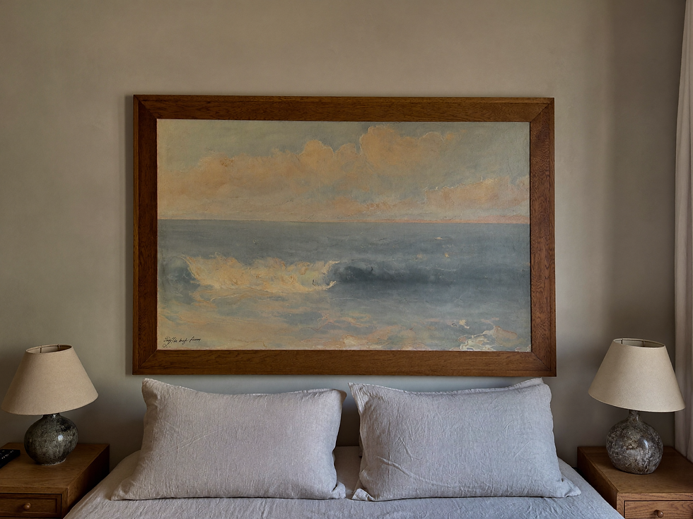
Begin with the largest elements: art, seating, rug, storage, and light. Add a second layer for function—a reading lamp, tray, basket, or side table. Only then introduce smaller objects. This order prevents accessories from deciding the room before its proportions are settled.
Vary height and texture, but keep the number of gestures limited. On a console beneath a painting, a lamp and low ceramic bowl may be enough. Their role is to support the vertical composition of the art, not compete with it. A little asymmetry often makes the arrangement feel more lived in.
Editing is not the removal of personality. It is how personality becomes legible. Keep the pieces that hold a memory, solve a need, or create a beautiful pause. Let the rest wait for another room.
Photograph the corner with your phone before making a final decision. The flattened view reveals visual noise quickly: competing heights, several small dark objects, or a frame that sits too close to the furniture. Correct only what interrupts the larger composition.
Make It Feel Collected, Not Recreated
The most convincing vintage interiors resist instant completion. They include something inherited, something discovered, something contemporary, and perhaps one piece whose origin is less important than the feeling it gives. That mixture prevents the room from reading as a period set.
Allow new objects to join slowly. A home develops refinement through repeated decisions, not a single shopping list. Notice which colors you return to, which subjects in art keep catching your attention, and which materials grow more beautiful through touch. Those patterns are the beginning of a personal vocabulary.
In the end, vintage decor feels refined when history remains present but relaxed. The painting can be dramatic; the room around it can breathe. The wood may show age; the layout can feel clear. Time becomes a layer of the interior, not its theme—and that is what lets the space stay relevant.
A collected home is also allowed to remain unfinished. The empty place beside a painting can be intentional until the right object appears. Patience is part of the aesthetic, and it often produces rooms that feel more truthful than those completed in a weekend.


Comments