Havenest Vintage Landscape Prints: A Curated Edit of Quiet Places
A landscape can become part of a home long before anyone measures the wall. First there is the private encounter: a pale line of sky, a path disappearing between trees, a field half-lost in weather. Something in the image feels familiar, though the place itself may never have existed.
That response sits at the center of the Havenest vintage landscape prints edit. The collection is not assembled by color alone, and certainly not by asking which picture will behave most politely above a sofa. Each work must hold its own atmosphere—quiet enough to live with, but distinct enough to keep revealing itself after the room around it becomes familiar.
This journal looks closely at the visual language behind the collection: misty meadows, old paths, orchard light and distant horizons. It is an invitation to choose a landscape as an image first, then decide how it might enter daily life.
In This Article
Begin With the Painting, Not the Room
Interior styling often begins with a practical question: what will fit? Curation begins one step earlier: what deserves attention? A strong landscape print should remain compelling when separated from furniture, paint swatches and trend language. Its light should have direction. Its distance should feel intentional. Its stillness should contain more than an empty field.
Landscape has never been a merely neutral genre. Tate defines landscape as one of the principal genres of Western art; across periods, artists have used it to consider labor, memory, belief, weather and the scale of human life. In nineteenth-century France, The Metropolitan Museum of Art notes that landscape moved from a minor academic category toward a major field of artistic experimentation.
That history matters because the best vintage landscape art does more than offer pleasant scenery. A horizon can create release. A dark tree line can hold unease. An orchard may suggest abundance, neglect or the passage of a season. Even a meadow without figures can feel inhabited by what has just happened—or what is about to.
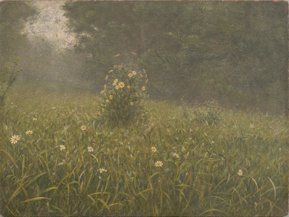
Three Forms of Quiet Landscape
The Havenest edit returns to three kinds of landscape because each creates a different emotional distance. They share a softened palette, but they do not tell the same story.
Misty meadows hold the nearest kind of quiet. Their grasses, haze and low horizons make the image feel bodily—as if the viewer could step into the damp air.
Countryside paths introduce narrative. A road or opening through trees gives the eye a direction, while leaving the destination unresolved.
Coastal horizons create the greatest distance. With fewer objects and a longer line of sight, they offer visual release without becoming blank.
Within those families, tone matters more than subject labels. A meadow can feel tender or desolate. A coast can be luminous or severe. An orchard may suggest shelter, but a darkening sky can turn that shelter into suspense. Curation is the work of noticing those differences rather than reducing every green field to “calm art.”
The palette is deliberately restrained: weathered olive, straw, umber, faded blue and the many colors that hide inside grey. This allows separate works to sit near one another without becoming a matching set. Harmony is useful; sameness is not.

What Gives a Vintage Landscape Staying Power
Age alone does not give an image depth. A brown filter, cracked texture or ornate frame can signal “vintage” quickly, but those effects cannot rescue a composition with nothing to say. Staying power comes from structure.
Look at how the image moves. A path may pull the eye inward, while a low branch slows it down. A bright cloud can balance a heavy foreground. Repeated tree trunks create rhythm; one break in that rhythm creates attention. These choices are quiet, yet they determine whether a picture feels spacious or merely empty.
Then look for evidence of touch. Soft passages need not be vague, and detailed passages need not be sharp. Painterly variation—a dragged brush through grass, a thin veil of atmospheric color, an edge allowed to dissolve—keeps the surface alive. When reproduced well, the print retains that movement instead of flattening it into generic nostalgia.
This is why the collection favors images whose beauty survives close viewing. From across the room, they create atmosphere. At arm’s length, the marks, tonal shifts and paper surface offer a second experience.

Choose the Place That Keeps Calling
A useful way to choose landscape art is to postpone the decorating question. Open the image on its own. Notice where your eye goes before you start naming colors or imagining frames. Is it the opening in the trees, the weather at the horizon, the small patch of light, or the absence of a figure?
That first point of attraction often reveals the kind of image you will continue to live with. Some viewers want refuge; they are drawn toward enclosed orchards and sheltered fields. Others want distance and choose water, mountains or long skies. A path appeals to the person who wants a story to continue beyond the frame.
There is no need to turn this into a personality test with a suspiciously accurate result. The point is simpler: attraction contains information. The landscape that pauses you for reasons you cannot immediately explain is often more enduring than the one that perfectly repeats the beige already in the room.
For a closer study of atmosphere, read Misty Meadow Art: How to Style Its Quiet Beauty at Home. It begins with one landscape mood and follows it from emotional response to scale, palette and placement.
Explore the Havenest vintage landscape collection—a quiet edit of meadows, old paths and distant horizons selected for what they make you feel before they become part of a room.

Let Paper, Scale and Framing Protect the Mood
Once the image has been chosen, materials should protect its character rather than decorate over it. Matte fine-art paper or cotton rag keeps pale skies soft and darker passages readable. A subtly textured sheet can echo brushwork, while a smooth matte finish suits landscapes built from delicate tonal transitions.
Scale changes the way the landscape is experienced. A larger horizontal print can become almost environmental: the eye enters the horizon before noticing the paper. A smaller print asks for closer attention and feels more like a page from a private collection. Neither is automatically better. The right scale depends on whether you want atmosphere or intimacy.
Frames should support that decision. Warm oak and walnut strengthen earth tones without making the work heavy. A slim aged-gold frame adds history to a quiet image; matte black gives a pale landscape a clean boundary. If the frame becomes the first thing you see, it is probably doing too much.
Choose matte or low-reflection glazing when soft tonal detail matters.
Leave a paper border or mat when the artwork needs visual breathing room.
Use canvas when visible surface texture is part of the appeal.
Test the intended size with paper on the wall before ordering a large print.
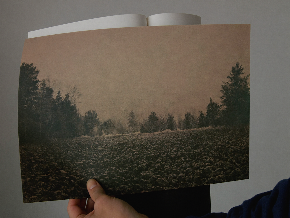
Inside the Havenest Landscape Edit
The Havenest landscape collection is built around places that feel remembered rather than documented. The meadow is softened by weather. The path disappears before becoming an answer. The horizon leaves enough room for the viewer’s own history.
That restraint is intentional. A home already contains voices, routines, unfinished mornings and changing light. Art does not need to compete with them. It can add another register: a slower visual rhythm, a sense of distance, a place the eye returns to when the room is busy.
The collection also belongs naturally beside the softer materials of a quiet luxury home—linen, timber, plaster and aged metal—but that is a consequence, not the reason for choosing it. The image must be worth looking at before it becomes useful to the interior.
A vintage landscape print should never feel like scenery assigned to a blank wall. At its best, it becomes a small geography of attention: somewhere to wander without leaving, and somewhere that changes slightly each time the light does.
Browse the Havenest landscape edit on Etsy and begin with the place you would want to return to—even if you cannot say where it is.


Comments