Van Beyeren’s Lobster and Fruit: A Feast Revealed by Light
At first, much of the table seems to disappear. Then the red lobster registers, followed by a pale lemon and the glints on a tall vessel. Abraham van Beyeren’s *Still Life with Lobster and Fruit* does not reveal its abundance evenly. It lets the eye assemble a feast from separate arrivals of light.
That order of discovery is worth keeping. A quick glance gives us an impression of dark richness. A longer look distinguishes metal from glass, translucent grapes from solid fruit, and a curling peel from the weight of the platter beneath it. The painting grows more particular as we stay.
The Metropolitan Museum of Art dates the work to probably the early 1650s. Its collection account describes a display of food and luxury objects, including Chinese porcelain. We can use that context while beginning with a simpler question: how does light make these things both recognizable and desirable?

Abraham van Beyeren, Still Life with Lobster and Fruit, probably early 1650s. Oil on wood. The Metropolitan Museum of Art, Gift of Edith Neuman de Végvár, in honor of her husband, Charles Neuman de Végvár, 1971. Public-domain image, The Met Open Access. Museum record.
In this article
Start with the red that anchors the table
The lobster occupies the lower left, extending its claws toward the edge. Its red is more emphatic than the brown and gold around it, so it establishes a strong point of entry. Yet the body is not a flat red shape. Pale marks and darker divisions describe the shell’s segments and changes in direction.
Look at how the lobster reaches outward while the main vertical vessel rises near the center. One form spreads; the other climbs. Their opposition gives the composition breadth and height without making it symmetrical. The table feels crowded, but it has a readable structure underneath that crowding.
The lobster also makes neighboring colors easier to notice. A lemon seems paler beside the red shell; the grapes at the right appear cooler and more translucent. Color is relational here. Naming each object’s local hue misses what the adjacency contributes. Before examining symbolism or ownership, this is a useful first exercise: ask which color lets you see another color more clearly. Our guide to five questions for reading a still life offers related ways into an unfamiliar arrangement.
Look for several kinds of brightness
The metal vessels catch sharp reflections. On the broad tipped form to the left of center, light gathers into curves that suggest a polished, rounded surface. Elsewhere it appears as tiny interruptions on stems and rims. These marks are small in relation to the darkness around them, but they carry a great deal of descriptive information.
The grapes produce another kind of brightness. Their pale bodies seem to hold light rather than simply reflect it from a hard exterior. The fruit beside them has a softer, more opaque glow. Compare these passages closely and the painting becomes an account of material differences. A bright mark means something different on shell, metal, glass, or skin.
Jan Davidsz de Heem’s *Still Life with a Glass and Oysters* compresses that same problem into a smaller collection of things. A lemon peel crosses glass, and pale grapes sit near shell. The comparison is useful because it strips the lesson back to essentials. Van Beyeren gives us more objects and a deeper surrounding darkness, but the conviction of the scene still depends on distinguishing one response to light from another.

Jan Davidsz de Heem, Still Life with a Glass and Oysters, ca. 1640. Oil on wood. The Metropolitan Museum of Art, Purchase, 1871. Public-domain image, The Met Open Access. Museum record.
Follow the lemon peel below the feast
The long peel falls from the cut lemon near the front, descends against the dark drapery, and curls outward near the bottom. Its thinness contrasts with the bulk of the fruit and vessels above. It is easy to read as a flourish, yet it performs an important compositional task: it carries the eye into a part of the image that might otherwise remain secondary.
The peel also introduces two surfaces within one narrow shape. A pale inner side turns against a rougher yellow exterior. As the strip twists, that difference helps us follow its orientation. We understand the movement through changes in color and edge, rather than through a single continuous outline alone.
Compare the lemon in de Heem’s *Still Life: A Banqueting Scene*. There the curl belongs to a much wider arrangement that extends into chairs, drapery, and architecture. Van Beyeren’s descending strip feels more isolated against the shadow below. A familiar motif can therefore produce different routes through different paintings. Seeing the repetition gives us a reason to ask what this particular peel does here, instead of treating all painted lemons as interchangeable signs.

Jan Davidsz de Heem, Still Life: A Banqueting Scene, ca. 1640–41. Oil on canvas. The Metropolitan Museum of Art, Charles B. Curtis Fund, 1912. Public-domain image, The Met Open Access. Museum record.
Let the darkness remain active
There is a large area of subdued space above and around the objects. It gives the tall vessel room to rise and leaves the brighter passages free to establish their own sequence. If every corner were equally illuminated, the eye would have fewer reasons to pause. The darkness contributes to the structure of looking.
It also allows some contours to become uncertain. A vessel can be clear in one passage and almost dissolve in another, while still remaining intelligible as a whole. Our vision completes relationships between the visible fragments. The painting asks for participation, although that participation is ordinary: we use the same ability whenever a familiar object sits partly in shadow.
Giuseppe Ruoppolo’s *Still Life of Fruit and Nuts* spreads its produce across a broad ledge, with dark background above. His pale grapes and scattered nuts become legible through selective illumination too, but the sideways movement is stronger. Put the two paintings beside each other and notice where your gaze travels first. Van Beyeren’s vertical architecture draws you upward; Ruoppolo’s groups encourage a longer passage from one side to the other.
A screen can make these dark passages appear very different depending on brightness and surrounding light. Rather than assuming an almost invisible contour has been omitted, give the reproduction a fair viewing condition. The purpose is to distinguish the relationships that remain visible, while recognizing that a digital image is one encounter with the painting rather than the painting itself.

Giuseppe Ruoppolo, Still Life of Fruit and Nuts, ca. 1660–69. Oil on canvas. The Metropolitan Museum of Art, Bequest of Errol M. Rudman, 2020. Public-domain image, The Met Open Access. Museum record.
Recognize the objects without reducing them to status
The Met identifies imported Chinese porcelain among the painting’s luxuries and reads this kind of display in relation to earthly enjoyment. That context helps us understand why the table contains so many materially distinctive things. The objects offer an occasion to admire craftsmanship and abundance alongside the painter’s ability to describe them. The museum record provides the historical framing.
Once recognized, however, the bowl still needs to be seen as part of the arrangement. Its pale patterned surface interrupts the darker vessels and supports the fruit above and around it. The pattern introduces small marks on a different scale from the large metal reflections. It is at once a represented object with a history and a patch of visual activity in the painting.
That double attention can make interpretation more generous. We can consider wealth and trade while remaining attentive to form. We can enjoy a convincing reflection without assuming the table describes an actual meal in an identifiable household. The painted arrangement gives abundant visual evidence; a detailed story about its original participants would require different evidence. Keeping those levels distinct leaves the image both vivid and credible.
Compare a display of pleasures with a vanitas
Edwaert Collier’s *Vanitas Still Life* also crowds a table with valued things. Books, instruments, a globe, metal vessels, and papers create a dense network. Its title makes the question of transience explicit. Beside it, Van Beyeren’s gathering of food and reflective objects feels more directly addressed to the senses.
The difference is not absolute. Fruit can suggest change, and a vanitas can be visually sumptuous. What matters is the emphasis established by each composition and the evidence supplied by its museum record. Collier’s papers and instruments imply activities interrupted; Van Beyeren’s surfaces keep bringing us back to color, touch, and light. Comparing them helps us resist a universal meaning imposed on every seventeenth-century still life.
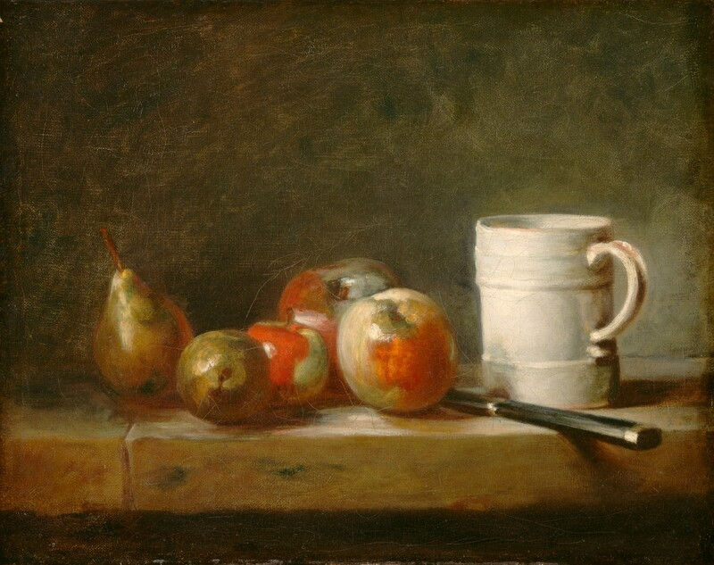
For another contrast, Chardin’s ordinary objects invite attention without requiring such a lavish inventory. And Cézanne’s treatment of still-life space reveals how uncertainty can be built through the table itself. These later approaches make Van Beyeren’s particular achievement clearer: his objects retain their material distinction even as darkness binds them into a single visual world.

Edwaert Collier, Vanitas Still Life, 1662. Oil on wood. The Metropolitan Museum of Art, Purchase, 1871. Public-domain image, The Met Open Access. Museum record.
Return for the detail you missed
For a final look, ask: which detail arrived only on the second look? It might be a reflection on a vessel, the changing side of the lemon peel, or a small fruit beneath the larger cluster. Finding it changes your relationship to the painting from recognition to discovery.
Try another pass with a narrower task. Follow only the pale marks, then only the rounded forms, then the exposed edges nearest the viewer. Each route will reveal a slightly different arrangement. The exercise works because the painting is organized strongly enough to sustain several paths without breaking apart.
Van Beyeren’s feast need not be understood in one sweep. Its darkness gives the objects time to emerge, and its varied surfaces reward the attention that follows. When you step away, the most memorable part may be a very small reflection. A little paint has made a large claim about a material surface, and your eye has accepted it. That exchange is one of the enduring pleasures of looking closely at still life.
Written by Havenest Studio


Comments