Havenest Pastoral Landscapes for Peaceful Rooms
Pastoral art rarely needs a grand subject to convey its essence and beauty. Instead, it often finds its inspiration in the simplicity of everyday life and the serene landscapes that surround us. This genre of art celebrates the tranquil and idyllic aspects of rural existence, focusing on the harmony between humanity and nature rather than grand historical events or heroic figures.
In pastoral art, the subjects are often humble yet profound, capturing moments that resonate with the viewer on a personal level. Artists may depict scenes of farmers tending to their fields, shepherds guiding their flocks, or families enjoying a leisurely day in the countryside. These subjects, while seemingly ordinary, invite contemplation and reflection on the rhythms of life and the connection to the land.
The landscapes portrayed in pastoral art are typically characterized by rolling hills, lush meadows, and serene bodies of water, all bathed in soft, natural light. This emphasis on the beauty of the natural world serves to evoke a sense of peace and tranquility, transporting the viewer to a simpler time and place. The use of color and light in these works often enhances the idyllic quality of the scenes, creating a dreamlike atmosphere that encourages viewers to escape the chaos of modern life.
Furthermore, pastoral art often incorporates elements of nostalgia, reminding us of a time when life was less complicated and more closely tied to the rhythms of nature. This longing for a simpler existence resonates deeply with many people, making pastoral scenes not only visually appealing but also emotionally impactful. The absence of grand subjects allows the viewer to engage with the artwork on a more intimate level, fostering a sense of connection to the depicted scenes and the underlying themes of peace, contentment, and the beauty of the natural world.
Pastoral landscape wall art works especially well in these spaces because it brings nature indoors without turning the room into a themed “country” interior. The strongest pieces feel timeless rather than rustic, atmospheric rather than decorative, and emotional without becoming sentimental.

What Makes a Landscape Feel Pastoral
Pastoral art is less about a checklist of subjects than a relationship between people, land, and time.
Historically, pastoral imagery often idealized rural life: fields, shepherds, grazing animals, cottages, paths, orchards, riverbanks, and distant villages. But a contemporary home does not need an overtly historical scene to receive the same emotional effect.
A painting can feel pastoral simply because the land is given room to breathe.
Look for compositions where nature occupies most of the visual field. Human presence, if it appears at all, is small: a distant figure, a path, a farmhouse, a fence, smoke from a chimney. Those details matter because they give scale without taking control of the scene.
In Havenest curation, we tend to favor landscapes where the eye can wander rather than stop abruptly. A path curves out of sight. Trees frame rather than block the view. A horizon creates distance. The sky carries weather. The painting feels inhabited, but not crowded.
That balance makes pastoral wall art unusually versatile. It can sit comfortably with modern furniture, antique pieces, wabi sabi textures, quiet luxury interiors, cottage-inspired rooms, or a simple neutral bedroom.
The art brings history and atmosphere without requiring the rest of the room to imitate it.

Open Horizons and the Feeling of Room
One reason pastoral landscapes work so well in interiors is the horizon.
A horizontal line across a painting gives the eye a sense of orientation. When that line sits at a comfortable height and the land recedes gradually, the image creates perceived depth. The wall remains exactly where it is, but attention is allowed to travel farther.
That matters in small rooms as much as large ones.
Above a sofa, a wide field can visually extend the furniture and make the wall feel less abrupt. In a bedroom, a distant hill can create a feeling of openness without introducing bright color or strong contrast. In a narrow entryway, a road or river that moves into the distance can make a transitional space feel less compressed.
The effect becomes strongest when the composition has breathing room.
Not every inch needs to contain detail. A broad area of sky, a simple field, mist between tree lines, or a pale distant ridge can be more powerful than a densely painted foreground. These quieter areas are not empty; they control the rhythm of looking.
For peaceful rooms, that rhythm is often more important than the subject itself.
Soft Light, Weather, and Emotional Tone
Pastoral landscapes become memorable when the weather feels present.
Clear midday light can make a field cheerful and direct. Morning haze adds uncertainty and distance. A lowering sky gives a simple meadow drama. Late sun can turn ordinary grass into gold. Mist can reduce a forest to layers of tone.
Havenest pieces often lean toward transitional light because it leaves more room for mood.
Dawn and evening are especially useful in interiors. Their colors tend to be softened rather than saturated, and their shadows create depth without harshness. The scene feels specific enough to have a story, yet open enough for the viewer to bring personal memory to it.
This is where “peaceful” should not be confused with “pale.”
A stormy pastoral scene can still feel restful if the composition is spacious and the tonal structure is controlled. Deep olive, charcoal, muted blue, and brown can create a cocooning kind of calm. Conversely, a very bright painting can feel restless if every area competes for attention.
The key is visual hierarchy: one place for light to gather, one clear route through the landscape, and enough quieter tone around it for the eye to recover.
Choosing a Pastoral Palette for Your Interior
A landscape does not need to match a room, but it should be able to live with it.
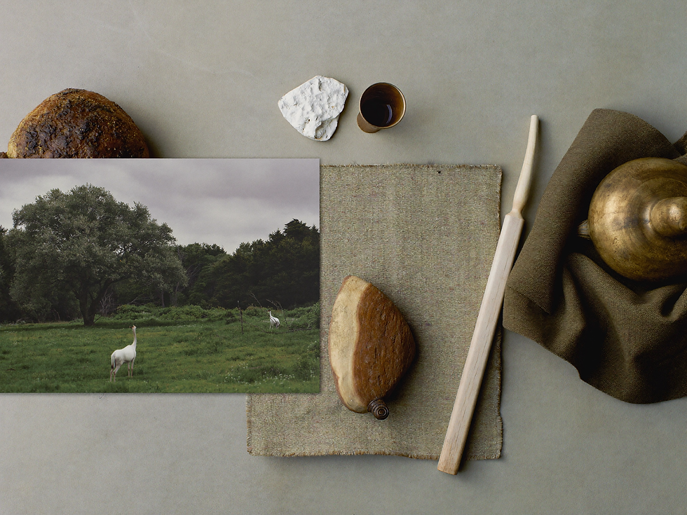
For warm neutral interiors, look for softened greens, cream, ochre, dusty blue, weathered brown, taupe, and muted gold. These colors sit naturally beside linen, oak, walnut, aged brass, plaster, wool, and stone.
If the room already contains a lot of beige, choose a painting with enough tonal depth to prevent everything from merging. Olive trees, a dark wooded edge, a blue-gray sky, or a walnut frame can create an anchor.
If the room is darker, a pale sky or illuminated field can act almost like a window.
For cooler coastal or contemporary rooms, pastoral art can still work beautifully when the greens lean gray, the sky carries silver-blue, and the frame is lighter oak or slim black.
The goal is not perfect coordination. In fact, a small degree of contrast usually makes the artwork feel more collected.
A useful rule is to repeat one or two relationships rather than exact colors: warm wood in the room and brown in the painting; linen cream and a pale sky; olive upholstery and a distant tree line. That is enough to create continuity without making the space feel designed around a swatch card.
Where Pastoral Art Works Best at Home
Pastoral landscapes are adaptable, but placement changes how they are experienced.
In the living room, a large horizontal piece above a sofa can become the primary emotional anchor. Choose enough width that the painting belongs to the furniture below it; undersized art often makes a calm room feel oddly unfinished.
In the bedroom, lower-contrast scenes work especially well. Mist, distant hills, gentle fields, and soft evening light support the slower pace of the room. A single landscape above the headboard can feel calmer than a busy gallery arrangement.
In an entryway, look for movement: a path, road, river, or line of trees that draws the eye inward. This makes the first view of the home feel inviting rather than static.
In a dining room, pastoral scenes bring nature and distance to a space dominated by tables, chairs, and hard horizontal surfaces. A long landscape above a sideboard can soften the architecture without feeling overly decorative.
And in a reading corner or home office, a smaller landscape can act as a visual pause. Place it where your gaze naturally lifts from a book or screen rather than filling a wall simply because it is empty.

Framing and Scale for a Collected Look
Frame choice changes the period and mood of a pastoral painting more than many people expect.
Natural oak keeps the image light and contemporary. Walnut adds warmth and makes muted greens or pale skies feel richer. Antique gold can bring old-world character, especially to Romantic or vintage-inspired landscapes, but it works best when the profile is restrained enough that the frame does not overwhelm the scene.
A thin black frame creates definition and can make pastoral art feel surprisingly modern.
For printable art, consider a generous mat when the image itself is delicate or small. For a large horizontal landscape, a narrower mat or full-bleed presentation often creates more presence.
Scale should be decided in relation to the wall and furniture, not by what feels comfortable on a product page.
Above a sofa, sideboard, or bed, a larger piece usually makes the room feel calmer because it reduces the need for surrounding filler. A small print can be beautiful, but it needs intentional context: a reading nook, a narrow wall, or a layered shelf rather than a vast empty expanse.
The goal is not maximum size. It is enough visual weight that the art looks chosen for the room.
Why Printable Pastoral Art Can Still Feel Substantial
Digital printable art is sometimes treated as temporary decor, but the file is only the beginning of the object.
Paper, scale, framing, matting, and placement determine how substantial the finished piece feels.
A pastoral image printed on matte heavyweight paper or fine-art cotton rag loses the glare associated with ordinary photo paper and gains a softer surface that suits vintage brushwork. For larger formats, a professional fine-art print can hold subtle gradients in sky, mist, and distant foliage that are easy to flatten on a low-quality home printer.
The frame then gives the image physical presence.
This flexibility is one of the reasons printable landscape art works well for people who care about interiors. The same file can be interpreted differently for different rooms: walnut and warm-white paper for a living room, lighter oak for a bedroom, antique gold for a more traditional setting.
It also allows the artwork to be scaled to the architecture instead of settling for one pre-manufactured size.
If the finished result is approached with the same attention you would give any art purchase—good paper, deliberate scale, considered framing—the fact that the artwork began as a digital file becomes almost irrelevant once it is on the wall.

Use the same principles—breathing room, softened color, and deliberate scale—when comparing pastoral prints for your own wall.
The lasting appeal of pastoral art may be that it gives us a relationship with distance.
The room stays where it is, but the eye can travel beyond it: across a field, toward a tree line, into weather, along a road, or to the pale edge of a horizon.
That movement is gentle, and gentleness is not the same as emptiness. A good pastoral painting can contain history, uncertainty, weather, memory, and human presence while still leaving enough room for the viewer.
For peaceful interiors, that balance is unusually valuable.
You do not need a room that looks rural. You need a painting whose pace belongs in the room you want to live in.
A Quiet Next Step
See the Vintage Orchard Landscape print on Etsy and choose the format that best suits your room.
Continue Reading
Continue with The French Landscape: How Forests, Fields, and Light Became Art, then read our guide to vintage art for homes.
Words and visual direction by Havenest.


Comments