Floral-Inspired Wall Decor for a Soft, Collected Home
Floral-inspired wall decor can make a room feel tender, lively, nostalgic, or dramatically grown-up. The result depends less on the flower itself than on how it is interpreted. A single rose rendered as a spare line drawing feels modern. The same rose in a Dutch-style still life feels historic and abundant. In a loose watercolor, it becomes airy and informal.
This range is exactly what makes floral art useful—and what makes choosing it surprisingly difficult. Without a clear direction, beautiful individual pieces can compete with one another. With restraint, one floral artwork can establish color, softness, and story while the rest of the room stays calm.
The guide below helps you choose a coherent floral language, select the right format and scale, build a balanced palette, and explore museum references before buying. The aim is a collected home, not a matching set.
In This Article
Choose a Floral Language, Not Just a Flower
Begin by deciding how you want the art to speak. Botanical studies are observant and structured. They suit rooms that need quiet detail. Floral still lifes feel more substantial because the vessel, tabletop, shadows, and surrounding objects create a complete interior world. Meadow scenes introduce movement and distance. Abstract florals use color and gesture rather than botanical accuracy.
Choose one leading language for the room. You can mix periods, but the works should share something meaningful: a similar palette, level of detail, mood, or framing approach. A dark seventeenth-century bouquet can live beside a simple pencil botanical if both feel intimate and are framed with related materials. Five unrelated floral styles often produce noise rather than charm.
When deciding, look at the architecture and daily use of the room. Clean modern spaces can benefit from painterly irregularity. Traditional rooms may need a simpler crop to avoid feeling overly decorated. Busy family spaces often suit a single generous composition better than many small detailed prints.

Match the Art Format to the Room
A vertical floral still life naturally suits the wall beside a window, between shelves, or above a narrow chest. A wide bouquet, meadow, or reclining branch works above a sofa, bed, console, or dining bench. Botanical pairs create rhythm in spaces where one large work would feel too heavy.
Think about viewing distance. A small, highly detailed study rewards close attention in an entryway, reading corner, or bedside setting. Across a living room, those details may disappear. Larger shapes, stronger value contrast, and simpler compositions remain legible from farther away.
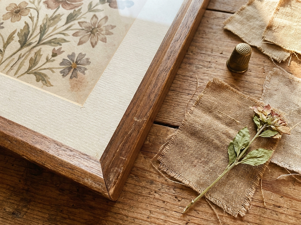
The material changes the mood too. Matte fine-art paper feels quiet and precise. Canvas softens edges and gives painterly work more physical presence. Textured paper can complement vintage botanicals, but heavy texture may blur delicate line work. Glossy surfaces often create glare and rarely support the soft, collected feeling Havenest rooms aim for.
Build a Refined Floral Palette
Do not pull every color from the artwork into the room. Select one dominant neutral, one supporting botanical tone, and one accent. A bouquet containing burgundy, rose, gold, green, cream, and blue might lead to an oatmeal sofa, olive throw, and only a small burgundy note in a book or candle.
Muted color does not mean weak color. Dusty rose beside moss green can be rich; faded blue beside walnut can feel luminous. The important quality is proportion. Let the largest surfaces remain quiet, give the art permission to carry variety, and repeat accent colors unevenly so the styling does not feel algorithmically matched.
Use warm cream instead of bright white beside aged floral pigment.
Repeat foliage colors more generously than flower colors.
Let one unexpected hue remain unique to the artwork.
Check the palette under both daylight and evening lamps before purchasing supporting textiles.
Real flowers can echo the art, but avoid copying the bouquet exactly. One branch, a loose seasonal stem, or a simple leafy cutting feels more natural. The room should respond to the artwork, not attempt to reenact it.
Use Scale, Frames, and Negative Space
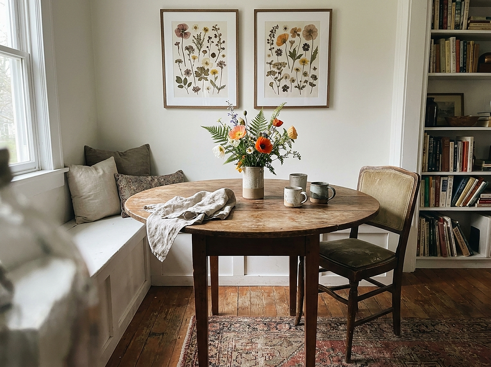
Scale should relate to the furniture below. For a single work above a sofa or bed, aim for approximately two-thirds to three-quarters of the furniture width. A coordinated pair can occupy the same visual span, with a consistent gap that reads as intentional.
Frames change the emotional temperature. Walnut grounds pink, burgundy, and olive. Pale oak keeps watercolor and modern florals fresh. Slim black frames create definition around loose shapes. Aged gold can suit still lifes beautifully, especially when the profile is refined rather than ornate.
Give intricate floral art a warm white or linen-toned mat. The border separates petals and stems from surrounding objects and prevents the image from feeling crowded. More immersive paintings may need only a narrow frame. Always leave clear wall around the final arrangement and edit the surface beneath it.

Our guide to serene wall decor offers additional help with hanging height, lighting, and negative space.
Study Floral Art Beyond the Shop
Museum collections help you recognize composition and craft before you shop. They also reveal how differently artists have treated the same subject. Rather than searching only for “pink flower print,” study where the light falls, how the bouquet occupies the frame, and whether the eye has quiet places to rest.
Clara Peeters’s A Bouquet of Flowers at The Metropolitan Museum of Art demonstrates remarkable structure in a compact vertical arrangement. Margareta Haverman’s A Vase of Flowers offers a fuller, more opulent composition with dramatic variety and depth.
Use these pages as visual education and review the rights information displayed for each work before downloading or reproducing it. Museum study can sharpen your buying decisions even when your final choice is a contemporary print.
Style Floral Wall Decor Room by Room
In a living room, let one substantial floral piece carry the color story across the space. In a bedroom, favor softened contrast and simpler silhouettes. Dining rooms can hold richer still lifes because vessels, fruit, and flowers naturally converse with the table. Entryways reward smaller botanicals that can be appreciated up close.
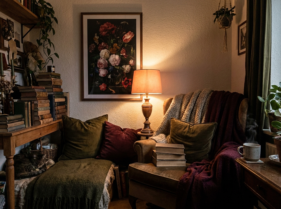
Reading corners suit moody florals, walnut frames, warm brass, and low lamplight. Bathrooms and kitchens need careful material choices: avoid steam, direct splash, and unprotected paper. A framed print with proper glazing and distance from moisture is safer than an exposed canvas.
For a looser, landscape-led alternative, continue with our guide to floral meadow wall art.
Floral wall decor is most convincing when it feels chosen for a room’s emotional life—not added because a space needs “something pretty.” Decide how the flowers should speak, give them enough scale and air, then allow the rest of the home to remain beautifully quiet.
Before committing, make a simple one-week test. Print the artwork on ordinary paper at reduced scale, tape it inside a temporary frame outline, and live with it through several mornings and evenings. Notice whether the palette still feels balanced when curtains are closed, lamps are on, and everyday objects return to the room. A floral work that succeeds only in a perfectly styled photograph may not be the one that supports real life.
Also consider how the room changes across the year. Rich still lifes often feel comforting in cooler months, while pale botanicals and watercolors remain visually light in summer. You do not need to rotate the art seasonally, but choosing a composition with both warm and cool notes gives textiles and accessories room to change around it without making the wall feel disconnected.
A final practical check is maintenance. Dust frames with a soft dry cloth, keep paper away from damp walls, and avoid placing delicate color in sustained direct sun. Small habits protect both the print and the calm visual effect you worked to create.


Comments