Floral Meadow Wall Art for a Calm, Light-Filled Home
A meadow does something a vase of flowers cannot. It stretches the eye toward a horizon, mixes order with a little wildness, and makes a room feel as though a window has been opened. Floral meadow wall art brings that feeling indoors through grasses, scattered blooms, softened skies, and color that seems to move rather than sit still.
The best pieces are not simply “floral.” They have depth, breathing room, and a sense of place. That makes them especially useful in calm, collected interiors where you want warmth without clutter. In this guide, we will look at how to choose the right mood and palette, find inspiring meadow art from trusted collections, size it for your wall, and frame it so the result feels refined rather than overly rustic.
In This Article
Why Floral Meadow Wall Art Feels So Restorative
Traditional botanical prints isolate a stem or bloom. A meadow scene does the opposite: it lets many small elements share the frame. Your eye moves from foreground flowers to soft grasses, then toward distant trees or sky. That visual journey creates a gentle sense of space, even in a compact apartment.
This is why meadow art works so well in rooms that need relief from straight lines. Sofas, cabinets, windows, and bookshelves are architectural; the loose rhythm of wildflowers softens their geometry. The effect is not fussy or overtly romantic when the palette is restrained. It is simply alive.
Look for variation rather than perfect repetition. A convincing meadow contains open patches, clusters, taller stems, and quiet areas. Those pauses matter. They prevent a colorful piece from feeling busy and give the room somewhere to rest.

Choose the Mood Before You Choose the Flowers
Begin with the atmosphere you want, not a list of favorite blooms. A misty meadow in gray-green and cream feels quiet and spacious. Poppies in coral and vermilion bring energy. Blue cornflowers and pale grasses can cool a warm room, while ochre, mauve, and olive make a neutral space feel autumnal and grounded.
Take one dominant color and one supporting color from the room. Then let the artwork introduce a smaller surprise: perhaps a dusty lilac in a beige bedroom or a clear blue note in an olive living room. Repeating every color already in the space can make the styling feel over-coordinated. One unexpected hue gives it life.
Before buying or printing, view the image at roughly the size it will appear on the wall. Tiny online previews can hide whether the work has enough contrast to hold a room. Save the image, place it on a photo of your wall, and check it in morning and evening light.
For a calm room, favor soft edges, generous sky, and two or three dominant hues.
For a brighter room, choose one vivid flower color balanced by quieter grass and foliage.
For a modern room, look for a wide crop, simplified forms, or an impressionistic surface.
For a vintage-leaning room, choose deeper greens, softened pigment, and an aged-paper or canvas feel.
Where to Find Floral Meadow Art Beyond Havenest
Havenest’s meadow edit is still growing, so this is a good moment to look beyond a single shop and build your eye through museum collections. Start by noticing composition, horizon height, and color relationships. You may discover that the landscape structure matters more to you than the exact flower species.
For a quiet, silvery example, explore Alfred Sisley’s Meadow (1875) at the National Gallery of Art. Its long grasses and scattered wildflowers show how a meadow can feel abundant without becoming decorative noise. For a broader flowering field with a strong horizontal sweep, see Egbert Rubertus Derk Schaap’s Meadow in Bloom (1913) at the Rijksmuseum.
If you prefer livelier color and a more recognizably Impressionist surface, study Claude Monet’s Poppy Field (Giverny), 1890–91, at the Art Institute of Chicago. These museum pages are valuable references even when you ultimately choose a contemporary printable: they help you recognize balanced color, depth, and brushwork rather than buying by keyword alone.

Check each institution’s image and rights information before downloading or reproducing a work. “View online,” “open access,” and “available as a print” are not always the same permission. When in doubt, use museum pages for inspiration and purchase through an authorized source.
Get the Scale, Crop, and Placement Right
Meadow compositions usually read best when they have room to travel sideways. Above a sofa, bed, console, or dining bench, a landscape format feels natural because it echoes the width of the furniture. As a starting point, let the artwork or grouped arrangement span about two-thirds to three-quarters of the furniture below it.
Hang the center near eye level, then adjust for the setting. Art above furniture should feel connected to it, not stranded high on the wall. A gap of roughly 15–25 centimeters often works, but the visual relationship matters more than a rule. Lower is usually better than people expect.
Crop changes the mood. A low horizon with plenty of sky feels airy. A close crop filled with grasses and petals feels immersive and energetic. For narrow walls, a vertical slice can be elegant, but avoid shrinking a complex meadow into a tiny frame; the small flowers may dissolve into visual static.
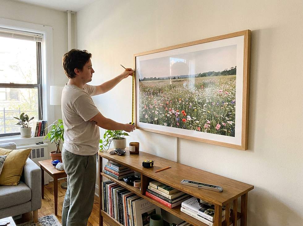
If you are planning several pieces, read our serene wall decor tips before committing to holes. The same principles—clear spacing, a steady visual line, and enough negative space—help floral work feel intentional.
Frame and Style the Meadow Without Making It Rustic
Wildflowers do not require farmhouse styling. The frame determines much of the final character. Pale oak keeps a blue-green meadow fresh and contemporary. Medium walnut adds structure to pinks, ochres, and muted foliage. A slim black frame can sharpen a pale, atmospheric scene in a more modern room.
Use a warm white or linen-toned mat when the image needs breathing room. Bright white can look abrupt beside aged pigment; cream often bridges art and wall more softly. For a large piece with strong edges, a narrow frame without a mat may feel more immersive.
Around the artwork, repeat texture rather than motif. Linen curtains, a wool throw, handmade ceramics, or a timber table quietly echo the natural subject. There is no need to add flower cushions, a floral rug, and a vase beneath the print. One real branch or a loose bundle of dried grass is usually enough.
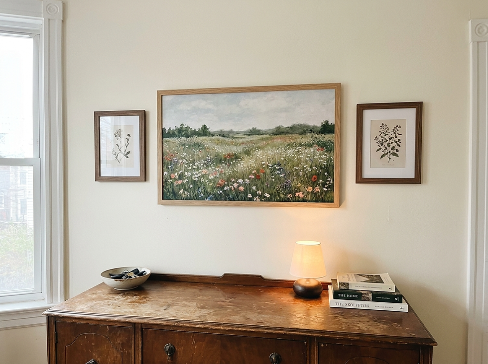
For a gallery wall, begin with one wide meadow as the anchor. Pair it with smaller botanical studies, a restrained landscape, or a simple abstract that repeats one color. Keep frame finishes related but not identical, and maintain a consistent gap so the arrangement feels collected rather than scattered.
Room by room, let the light guide the styling. In a living room, moderate contrast helps the art hold its own across the space. In a bedroom, softened edges and lower saturation support rest. In a hallway or reading corner, a smaller, darker meadow can create intimacy—especially under a warm picture light.
If your home leans more traditional, our guide to classic wall art inspiration offers a useful way to mix older references with clean, modern furnishings.
Let the Room Keep a Little Wildness
The charm of floral meadow wall art lies in its refusal to be perfectly arranged. Choose a piece with asymmetry, open ground, and a few wandering stems; then allow the room to carry that looseness. A book left open, linen that is not over-pressed, or a branch that bends to one side can make the composition feel at home.
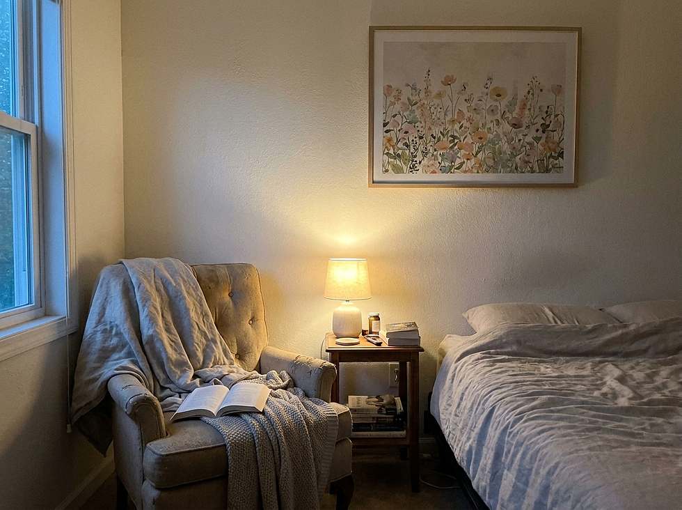
Most importantly, buy for the feeling you want to return to. The right meadow does not merely match the sofa. It creates distance, air, and a small daily encounter with the outdoors. Framed thoughtfully and given enough space, it can make even an ordinary wall feel open, personal, and quietly alive.


Comments