De Heem’s Glass and Oysters: A Feast Made for One Viewer
Updated: 4 days ago
Before the eye has finished identifying the objects, the mouth may already have reacted. A curl of lemon peel hangs above opened oysters. Grapes catch the light beside a glass. Everything seems close enough to touch, although the painted surface keeps the meal permanently beyond reach.
Jan Davidsz de Heem’s Still Life with a Glass and Oysters, dated about 1640, turns that small distance into its subject. Looking becomes a rehearsal for handling, smelling, and tasting. Yet the painting has another surprise: its modest size makes this abundant encounter feel private.
We can approach it as a carefully arranged conversation between appetite and attention. That is a reading of the visible composition, not a claim that every object conceals a single message. The most revealing place to begin is the distance between the picture and its viewer.

Jan Davidsz de Heem, Still Life with a Glass and Oysters, ca. 1640. Oil on wood. The Metropolitan Museum of Art, Purchase, 1871. Public-domain image, The Met Open Access. Museum record.
In this article
A small painting asks for a different kind of attention
The Metropolitan Museum of Art’s record identifies the work as oil on wood, measuring 9 7/8 by 7 1/2 inches. The museum connects this diminutive format with a collector’s cabinet and close individual viewing. Those dimensions matter. A picture smaller than many modern magazines can draw the body inward rather than dominate a room.
On a screen, we can accidentally erase that relationship by enlarging every artwork to the same size. Imagine instead holding a rectangle approximately ten inches tall. The grapes become small discoveries. The glass must be approached. Details acquire intensity because the entire encounter occupies such a concentrated area.
This physical intimacy changes how abundance feels. There is plenty to inspect, but no immense banquet into which a crowd could disappear. A single viewer can move among the objects repeatedly. For a practical way to sustain that attention, our five questions for reading a still life begin with observation before symbolism. Here, the first question might simply be: where does your eye lean closer?
Follow the lemon peel before naming its meaning
The lemon’s yellow skin provides a route through the arrangement. It curls around the upper part of the glass and descends in a ribbon, its pale underside changing direction as it falls. Beside the restrained browns and greens, yellow feels unusually articulate. The peel gives the eye a line to follow through objects that otherwise form rounded, compact masses.
Trace that line without deciding what it means. Notice where a bright edge becomes a shaded turn. Notice how the broad fruit and thin peel offer two forms of the same material. The effect is both descriptive and rhythmic: a citrus skin becomes an almost drawn gesture within the painted scene.
A useful comparison is Willem Kalf’s Still Life with Fruit, Glassware, and a Wanli Bowl. There, another peel spills from a bowl against deep darkness. In Kalf, it leads us across a precarious arrangement of vessels; in De Heem, it helps bind a smaller group into a concentrated circuit. The recurring motif need not carry an identical interpretation in both works. Its visual job changes with its neighbors.

Willem Kalf, Still Life with Fruit, Glassware, and a Wanli Bowl, 1659. Oil on canvas. The Metropolitan Museum of Art, Maria DeWitt Jesup Fund, 1953. Public-domain image, The Met Open Access. Museum record.
Glass, shells, and grapes make light tangible
Three surfaces ask for three different kinds of looking. The glass admits light while retaining the edges that tell us it has a body. The oyster shells are opaque and irregular. The grapes seem to hold brightness inside their skins. We recognize those differences through small changes in painted value and color, rather than through touch.
The nearer shell extends horizontally, interrupting the vertical presence of the glass. Grapes accumulate at the right, some more luminous than others. A darker cloth drops below the tabletop. These changes in direction and texture stop the arrangement from becoming a simple catalog of edible things. Our attention alternates between an object's identity and the manner of its appearance.
Compare the generous clusters in Abraham van Beyeren’s Still Life with Lobster and Fruit. The lobster’s red draws attention across a wider, more crowded display, while reflective vessels and fruit distribute smaller flashes. De Heem’s compact painting offers fewer competing destinations. The difference helps explain why its individual sensations can feel so immediate: each surface has more room in our attention, even though the actual panel is small.
The grapes are especially useful for testing this alternation between matter and paint. Look for the places where neighboring fruits almost merge, then for the thin divisions that separate them again. Their roundness depends on unequal illumination. A uniformly bright cluster would give us less information about volume, while a uniformly dark one would lose the sense of skins enclosing something translucent.

Abraham van Beyeren, Still Life with Lobster and Fruit, probably early 1650s. Oil on wood. The Metropolitan Museum of Art, Gift of Edith Neuman de Végvár, in honor of her husband, Charles Neuman de Végvár, 1971. Public-domain image, The Met Open Access. Museum record.
Abundance can be expansive or concentrated
De Heem also painted a strikingly different table in Still Life: A Banqueting Scene, dated about 1640–41. The broad canvas spreads food, vessels, textiles, and other objects across an elaborate setting. Your eye travels sideways, finding additional episodes. Its abundance develops through accumulation and extension.
Place that painting beside Glass and Oysters and the change is instructive. The small panel gathers rather than spreads. A few materials overlap, and the arrangement rises toward the glass. There is little space to imagine walking around the table. Instead, the viewer receives an unusually close invitation to examine its edge.
Neither format is automatically more intimate in emotional meaning; people respond differently. But the compositions organize looking differently. The banquet encourages surveying, while the smaller still life encourages returning to a tight cluster. That distinction is useful whenever we call a painting luxurious. Are we responding to the expense suggested by its objects, to their number, or to the care with which a handful of surfaces has been made visible? Those are separate pleasures.

Jan Davidsz de Heem, Still Life: A Banqueting Scene, ca. 1640–41. Oil on canvas. The Metropolitan Museum of Art, Charles B. Curtis Fund, 1912. Public-domain image, The Met Open Access. Museum record.
Appetite is a response, not a complete explanation
The Met notes that oysters were associated with aphrodisiac properties in the period. That historical context is useful, but it should not close the painting like a solved riddle. Identifying a period association does not establish exactly how every collector interpreted this particular panel, much less how every modern viewer should feel before it.
We can acknowledge that association while remaining with the sensory evidence. The cut lemon makes freshness almost imaginable; the oysters suggest moisture; the glass appears cool. These reactions belong partly to our own memories of materials and meals. A viewer who dislikes oysters may find the shells more compelling than their contents. Someone else may respond first to the grapes.
Manet’s Strawberries supplies a productive comparison. Its small basket activates appetite through warmer color and more visibly broken handling. The berries are recognizable without the same sustained finish as De Heem’s glass. Both pictures let paint summon a bodily response. Seeing them together reminds us that sensory vividness has more than one technique, and that detailed description is only one route toward it.

Edouard Manet, Strawberries, ca. 1882. Oil on canvas. The Metropolitan Museum of Art, Gift of Mr. and Mrs. Nate B. Spingold, 1956. Public-domain image, The Met Open Access. Museum record.
The absent hand gives the arrangement its tension
No person lifts the glass or reaches toward the oysters. The meal remains available in appearance and inaccessible in fact. That separation is central to the pleasure of still life: a painted object can look ready for use while remaining outside ordinary time. The glass will never empty. The peel will not fall farther.
It is tempting to invent the diner who has just stepped away. We may do so as imaginative play, but the picture does not provide that biography. What it does provide is a table edge, objects associated with eating, and enough proximity to make our own hands part of the imagined encounter. We supply the action that the composition withholds.
This is different from the spatial uncertainty explored in our essay on Cézanne’s unsettled still lifes. De Heem’s tension rests less on competing viewpoints than on the distance between convincing material presence and the flat painted surface. In one case we wonder how the objects sit; in the other we almost forget that we cannot pick them up. Both reactions make looking active.
Return to the smallest highlight
At the end of a close reading, try returning to the picture without its title. Choose one highlight on the glass or one pale edge of shell. Follow it until it disappears into shade. This takes attention away from the prestigious name and the historical category and returns it to the work that the paint performs.
Then step back. The lemon, oysters, grapes, and glass become a group again, held above the darker fall of cloth. What seemed a collection of independent textures resolves into a compact exchange of light. The panel’s scale now feels less like a limitation than the condition of its particular invitation.
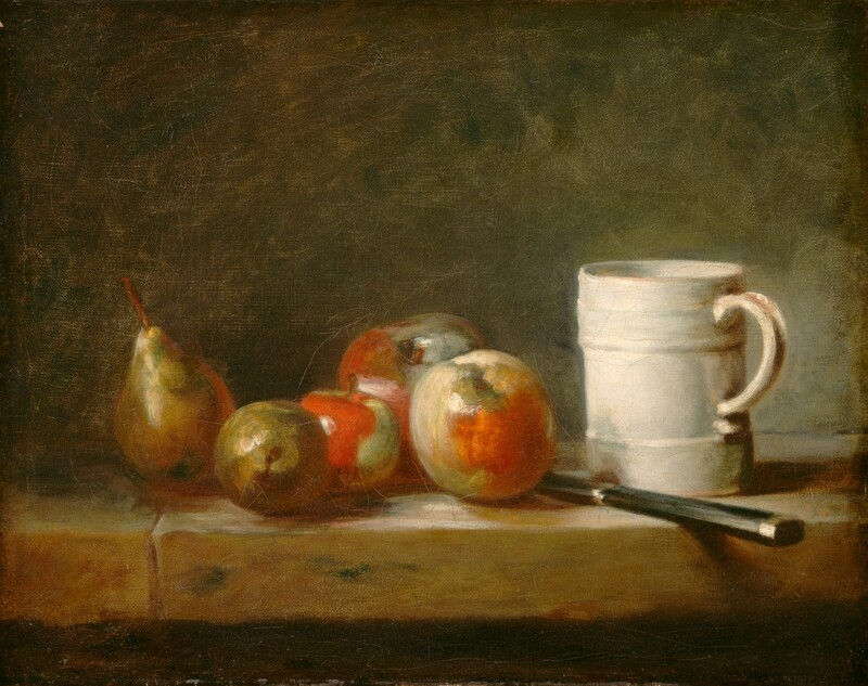
For another approach to the significance of familiar things, read Chardin and the dignity of ordinary objects. The comparison need not turn either artist into a lesson in virtue. It can simply broaden the question we bring to a tabletop: how does an arrangement make us care about what is in front of us? De Heem answers through an appetite for surfaces, and through the feeling that one viewer, leaning closer, is enough.
Written by Havenest Studio


Comments