Cézanne’s Jar, Cup, and Apples: When the Wallpaper Joins the Table
The cup is almost central, pale and open, with a dark green band below its rim. Behind it, a repeating wallpaper pattern crosses the wall. Below it, a white cloth spills over furniture painted with blue floral marks. The room seems to answer the objects on its table.
In Paul Cézanne’s Still Life with Jar, Cup, and Apples, dated about 1877, a small domestic arrangement becomes a study of echoes. Curves reappear at different scales; blues move from wall to cloth to painted decoration; a jar and cup interrupt the pattern without escaping it.
The most revealing entrance is therefore the room itself. Rather than treating the wallpaper as a backdrop, follow it toward the objects and down across the furniture. This painting rewards attention to the surfaces we usually place behind the subject.
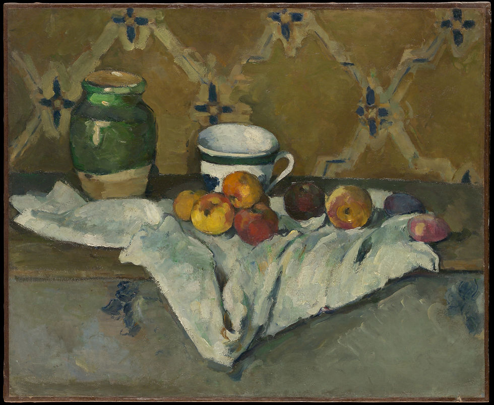
Paul Cézanne, Still Life with Jar, Cup, and Apples, ca. 1877. Oil on canvas. The Metropolitan Museum of Art, H. O. Havemeyer Collection, Bequest of Mrs. H. O. Havemeyer, 1929. Public-domain image, The Met Open Access. Museum record.
In this article
The Wallpaper Is Evidence as Well as Pattern
The background consists of a warm field crossed by pale, curving bands and darker blue floral forms. Its repetition gives the upper half a steady rhythm, but brushwork keeps the pattern from feeling mechanically uniform. Some motifs are clearer than others; several are partly concealed by the vessels.
The Met identifies this wallpaper in six works Cézanne painted around 1877, when he rented an apartment on rue de l’Ouest in Paris. That detail ties the represented surface to a documented setting. We do not need to invent a conversation or domestic incident to recognize the room’s historical specificity.
At the same time, the wallpaper does work inside the painting. Its pattern gives us repeated shapes against which to measure the jar and cup. A vessel interrupts the design, making its silhouette easier to notice. The wall continues around the objects, keeping them within a shared decorative field.
Try looking at the wallpaper first, then allowing the objects to come forward. The arrangement may feel shallower than it did when you began with the fruit. The background is visually active enough to remain present, even while overlap tells us that the jar and cup stand in front of it.
One Cup Makes a Hinge Between the Groups
The cup’s pale interior offers one of the broadest light areas above the cloth. Its handle curves to the right, while its darker band connects visually to the green jar on the left. The cup participates in both sides of the composition without becoming identical to either.
Below it, warm fruit gathers toward the middle. Farther right, the apples are more separated, each given a small interval. The cup provides a transition between the jar’s concentrated upright mass and this looser horizontal sequence. Its rounded opening also repeats the fruit’s curves at a different scale.
In Camille Pissarro’s Still Life with Apples and Pitcher, painted in 1872, a blue pitcher rises behind a compact group of apples. Floral wallpaper echoes the decoration on the vessel. A glass introduces another upright form at the right.
The comparison makes two arrangements of domestic pattern available to us. Pissarro’s wallpaper is relatively delicate and spaced; Cézanne’s occupies the wall in larger, more insistent shapes. In each image, the objects gain character from the room around them. A pitcher or cup is never encountered entirely alone, even when it first seems to be the subject.

Camille Pissarro, Still Life with Apples and Pitcher, 1872. Oil on canvas. The Metropolitan Museum of Art, Purchase, Mr. and Mrs. Richard J. Bernhard Gift, by exchange, 1983. Public-domain image, The Met Open Access. Museum record.
The Cloth Carries the Pattern Downward
White fabric lies beneath the fruit and spills over the furniture’s front. Its folds form a large, irregular pale shape, bringing brightness into the lower half. Blue-gray shadows divide it into smaller planes. The cloth can be read as a material surface and as a broad compositional gesture.
Notice how its outline bends and narrows. Those changes have a family resemblance to the wallpaper’s looping forms, though the cloth is more irregular and three-dimensional. The relationship does not require exact repetition. A curve can echo another while belonging to an entirely different thing.
Cézanne’s later Still Life with a Ginger Jar and Eggplants, from 1893–94, expands this involvement of fabric. Patterned cloth occupies much of the foreground, while bindings around vessels introduce further diagonals. The painting offers many more overlapping routes.
Seen beside that later arrangement, the cloth in Jar, Cup, and Apples feels more concentrated. It links the fruit above to the decorated furniture below in one substantial fall. This is a useful work-specific distinction: we are looking at an early domestic network of echoes, rather than treating every Cézanne still life as the same demonstration of unstable perspective.

Paul Cézanne, Still Life with a Ginger Jar and Eggplants, 1893–94. Oil on canvas. The Metropolitan Museum of Art, Bequest of Stephen C. Clark, 1960. Public-domain image, The Met Open Access. Museum record.
The Painted Chest Refuses to Stay Beneath the Subject
At the bottom, blue decorative marks appear on the furniture’s front. The cloth conceals part of that surface, leaving enough visible to establish another layer of pattern. The still life therefore contains painted objects, painted fabric folds, and a depiction of painting on furniture.
The Met specifically notes the relationship between the wallpaper, the cloth’s shape, and this floral decoration. Looking at their actual placement makes that observation concrete. Decoration is distributed vertically: above the objects, beneath them, and around the fabric that connects the two levels. The composition becomes more cohesive as these repetitions register.
This does not mean every blue mark has an identical function. On the wall, blue contributes to a repeating motif. On the cloth, it helps articulate shadow and fold. On the chest, it belongs to a painted design. The color links materials whose roles remain different.
A similar method can guide the reading of many interiors in art. Ask where a color returns, then ask what it is doing in each location. Our five questions for reading still life offers a framework for turning such observations into interpretation without reducing a painting to a list of hidden symbols.
Fruit Makes Exceptions to the Decorative Rhythm
The apples introduce a warmer range of yellow, orange, red, and purple into the green-brown room. Their shapes repeat, but their sizes and positions vary. Some overlap closely under the cup; others occupy individual pockets of cloth toward the right.
Because the wallpaper supplies a repeated pattern, the fruit’s irregular grouping becomes especially visible. A decorative system and an organic arrangement coexist. The apples do not need to march in a row to make the composition coherent. Their unevenness gives us something to compare against the steadier rhythm behind them.
In Still Life with Apples and Pears, dated about 1891–92, Cézanne presents fruit on plates and bare wood with no large floral wallpaper field. The colors and forms of the fruit must therefore carry a greater share of the immediate visual variety.
That comparison helps us separate an artist’s recurring subject from the job it performs in a particular painting. An apple can interrupt a pattern here and dominate a relatively spare table elsewhere. Its meaning for our eye develops through context. For a broader account of Cézanne’s spatial experiments, read why his still lifes refuse to sit still.

Paul Cézanne, Still Life with Apples and Pears, ca. 1891–92. Oil on canvas. The Metropolitan Museum of Art, Bequest of Stephen C. Clark, 1960. Public-domain image, The Met Open Access. Museum record.
A Plain Background Changes What We Notice
Henri Fantin-Latour’s Still Life with Roses and Fruit, from 1863, sets flowers, grapes, and a pear against a dark, largely unpatterned field. The objects receive much of their character from their silhouettes and the intervals between them. Little behind them competes for recognition.
Return to Cézanne’s cup after that comparison. Its upper curve now has a different kind of company. Wallpaper motifs sit close behind, and their outlines remain visible around the rim and handle. The cup’s presence depends on how it interrupts an already active surface.
This can affect the mood of an image as much as its colors do. A plain field may make objects feel isolated or contemplative. A patterned field can make a room feel inhabited, layered, or visually close. These are possible viewer responses, not guaranteed emotional effects or evidence of the painter’s private intentions.
When comparing paintings, it is worth naming the background before judging the subject. The same cup could feel very different against open gray, deep brown, or repeating flowers. Here, the wallpaper helps turn a small collection of household things into a specific room whose surfaces remain part of the encounter.

Henri Fantin-Latour, Still Life with Roses and Fruit, 1863. Oil on canvas. The Metropolitan Museum of Art, Bequest of Alice A. Hay, 1987. Public-domain image, The Met Open Access. Museum record.
Let the Room Become Visible Again
Take a final look without beginning at the fruit. Start with a blue wallpaper motif, move to the cup’s band, descend through a cool shadow in the cloth, and finish at the decoration on the furniture. The route crosses several materials while staying within one related family of color.
Then reverse the exercise. Follow the cloth’s irregular edge against the steadier furniture, or the cup’s curved handle against the wall pattern. The composition becomes legible through differences as well as similarities. Repetition creates connection; interruption keeps that connection from becoming monotonous.
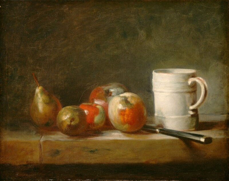
This attention to a room’s ordinary surfaces belongs beside Chardin and the dignity of household objects. Both approaches encourage us to consider what familiarity can conceal. A chest front, a cup, or a piece of fabric may deserve more attention than its everyday usefulness usually receives.
The pale cup remains my resting point, but it no longer seems to hold the scene by itself. Wallpaper, cloth, fruit, and painted wood continually lend it their company. Looking closely lets the room come forward, until the things behind and beneath the subject become inseparable from the reason we keep looking.
Written by Havenest Studio


Comments