Golden Pear Wall Art for a Breakfast Nook With Character

A breakfast setting gives the stacked fruit a familiar domestic context. Havenest room visualization; framing and furnishings are shown for styling inspiration.
A breakfast nook often gets its personality from a small patch of wall. The table may be practical, the chairs familiar, and the window the best thing about the room. One picture has to give those ordinary ingredients a more particular relationship.
A golden pear still life is an appealing possibility because its subject already belongs to the scale of daily life. Fruit is recognizable at a glance, but a painted arrangement offers more than a picture of something to eat. Shape, color, and the way objects lean toward one another can make a modest subject hold a wall.
Havenest's Pears in a Golden Stack invites that closer look. Before choosing accessories or a frame, begin with the picture itself: what carries its weight, where its color gathers, and how much surrounding space it needs.
In this article
Read the arrangement before building a theme
The first useful question is where your eye lands. With a stacked pear composition, the relationship between rounded bodies and narrower necks gives the subject its rhythm. Read the fruit as connected forms before you read it as kitchen decoration. That distinction helps you see why an arrangement can feel lively even when nothing in it moves.
In the illustrated arrangement, a small golden pear sits above a larger pear turned to the side, with a round russet fruit supporting the stack. A long upper stem ends in a tiny white blossom. Against the pale background, that unlikely tower reads almost like a small sculpture: broad at its center, delicate at its highest point, and playful without needing a busy setting.

The slender upper stem and broader central fruit give the arrangement its vertical rhythm.
Follow the changes in direction. A pear that leans one way can answer another that tilts back; a broad lower shape can give a smaller upper form something to rest against. The stack keeps the eye moving between weight and delicacy, turning familiar fruit into an unexpectedly animated arrangement.
In the room, let this structure remain visible. A nearby shelf loaded with small objects can scatter attention before it reaches the picture. Start by clearing the immediate area, then return only what you actually use. The artwork should be easy to read from the place where breakfast happens, rather than requiring a perfectly staged photograph.
Use the gold as a color note, not a shopping list
Golden fruit offers a way to introduce warmth without repainting a room. The important decision is how much of that warmth you want to repeat. One modest echo, perhaps a straw-colored seat cushion or the natural tone of a wooden bowl, is usually easier to live with than a coordinated collection of yellow accessories.
Begin with the colors already present. A pale table, cream wall, and darker chair frame make different demands on an image than red-toned wood and patterned upholstery. Hold those materials in mind while looking at the listing photographs. The aim is to find a relationship between the artwork and the room, rather than to declare every warm shade a match.

An alternative interior setting shows how pale textiles and warm wood can answer the gold.
If the surrounding scheme already feels yellow, let the pear image carry the strongest gold and use more restrained tones around it. If the nook feels visually pale, a darker frame may give the picture definition. Havenest's guide to warm neutral living rooms explores the larger relationship between undertone and contrast; the same questions are useful in a smaller dining corner.
Give the picture a role beside the table
Imagine the nook during an ordinary weekday. A mug sits near the window, someone has left a notebook open, and a chair is pulled slightly away from the table. The artwork has to work with that level of activity. It need not turn the whole room into a still-life set.
Try the wall seen from the most-used seat first. A picture directly behind that chair may look excellent from the doorway but go unseen by the person who spends the most time there. A side wall can offer a more companionable view, especially when the opposite side of the nook opens into a busy kitchen.
Consider what the wall already does. If a window provides a strong focal point, the print can become a smaller counterpoint. If the corner lacks a clear visual center, the framed artwork may need a more substantial presence. These are different jobs. Make that decision before choosing a frame size, and the rest of the arrangement becomes much easier to judge.
Choose materials that answer the subject
The pear motif can sit comfortably beside many materials, but the combinations produce different moods. Wood introduces grain and a firm edge. Woven fabric brings smaller variations of light and shadow. Smooth ceramics give the eye a simpler surface after the detail of a painted subject. Use these differences deliberately.
A wooden table and a woven seat already provide texture; you may need very little else. On a glossy white table, a plain fabric runner could create a softer connection to the artwork. These are styling options, not requirements. Keep the table useful, and avoid choosing a surface treatment that makes daily cleaning or serving more difficult.
For a fuller discussion of those relationships, read how to style a room with linen, wood, and soft art. Here, the most useful lesson is restraint: let each material do something different. The print can supply the concentrated color and recognizable subject, leaving the furniture and textiles to provide structure and touch.
Choose the frame as part of the composition
A frame is the point where a picture meets the room. A slender dark edge can make the boundary clear. A wood finish may connect the print to the table or chairs. A more decorative profile can add emphasis, but it also introduces another pattern for the eye to read.
Compare a few finishes beside the actual wall color. Avoid judging a frame only against the brightest part of the fruit. Look at the entire image, including its darker areas and surrounding field. The frame should help the whole composition settle into place, rather than isolate one color and exaggerate it.
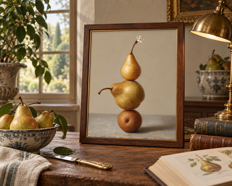
A closer illustrative setting makes the frame edge and the fruit composition easier to compare.
A mat or visible border changes the balance again. More surrounding space can make the image feel deliberate on a small wall, but it also reduces the artwork's share of the overall frame. Test the complete outer dimensions with paper before buying. If you want a broad framed presence, confirm that the image itself will still be large enough to enjoy from your usual seat. Review the current listing and your chosen framing service for the actual format and fit.
Test the view from the chair
Standing in front of an empty wall is only one way to assess a picture. In a breakfast nook, the seated view matters at least as much. Tape a paper outline of the proposed outer frame to the wall, sit down, and see whether the position feels connected to the table without being crowded by it.
Check the practical edges. Chair backs move. A hinged window may need clearance. A pendant light can overlap the artwork from certain angles even when it sits well away from the wall. Walk through the space with those everyday movements in mind, rather than considering only the straight-on view.

A lived-in viewing context helps you think beyond the straight-on photograph.
For a picture positioned above a bench, cabinet, or another substantial piece, Havenest's guide to hanging wall art above furniture provides a useful starting point. Then adjust to the actual room. The goal is a placement that belongs to the furniture and remains comfortable to look at, not a number followed without regard to the space.
Let the fruit stay the focus
It is tempting to finish a pear picture with a bowl of pears, pear-colored napkins, and another fruit print nearby. An occasional visual echo can be charming, but literal repetition is optional. The artwork already names the subject. The room can answer it through shape or color instead.
A rounded ceramic cup might pick up the fruit's form without repeating it. A simple chair curve could make a similar connection. Or the picture may be the only rounded, warm-colored element in an otherwise linear nook. That contrast can be a reason to choose it, rather than a problem to solve.

The same subject can take on a more formal character after the lights come on.
Before adding anything else, leave the arrangement in place for a few ordinary mornings. Notice whether the art feels present from the table, whether the frame interrupts the window view, and whether the wall needs more space around it. If the picture is doing its job, the final styling move may be to stop. A breakfast corner gains character when one choice is allowed to speak clearly.
If this balance of familiar subject and sculptural arrangement fits your room, explore Havenest's golden pear still life on Etsy. Use the current listing to review the available purchase details and imagery before deciding how you would frame and place it.
The most convincing setting may be a small one: a useful table, daylight, and a picture that gives you something to notice before the rest of the day begins.
Written by Max · Havenest Content Team
Comments